300 픽셀 크기의 div가 있으며 페이지가 내용의 맨 아래로 스크롤 될 때 원합니다. 이 div에는 동적으로 콘텐츠가 추가되어 계속 스크롤되어 있어야합니다. 이제 사용자가 위로 스크롤하기로 결정한 경우 사용자가 다시 아래로 스크롤 할 때까지 맨 아래로 다시 이동하고 싶지 않습니다.
사용자가 위로 스크롤하지 않으면 사용자가 맨 아래로 스크롤하지 않으면 맨 아래로 스크롤 된 div를 가질 수 있습니까? 그리고 사용자가 맨 아래로 다시 스크롤하면 새로운 동적 내용이 추가 된 경우에도 맨 아래에 있어야합니다. 이것을 만들어내는 방법은 무엇입니까?
답변
이것은 당신을 도울 수 있습니다 :
var element = document.getElementById("yourDivID");
element.scrollTop = element.scrollHeight;
[편집] 댓글과 일치합니다 …
function updateScroll(){
    var element = document.getElementById("yourDivID");
    element.scrollTop = element.scrollHeight;
}
내용이 추가 될 때마다 updateScroll () 함수를 호출하거나 타이머를 설정하십시오.
//once a second
setInterval(updateScroll,1000);
사용자가 이동하지 않은 경우에만 업데이트하려는 경우 :
var scrolled = false;
function updateScroll(){
    if(!scrolled){
        var element = document.getElementById("yourDivID");
        element.scrollTop = element.scrollHeight;
    }
}

$("#yourDivID").on('scroll', function(){
    scrolled=true;
});
답변
CSS로만 작동하도록 할 수있었습니다.
트릭은 사용 display: flex;하고flex-direction: column-reverse;
브라우저는 하단을 상단과 같이 취급합니다. 지원하는 브라우저를 지원한다고 가정하면 flex-box유일한주의 사항은 마크 업이 역순이어야한다는 것입니다.
다음은 실제 예입니다. https://codepen.io/jimbol/pen/YVJzBg
답변
방금 이것을 구현했으며 아마도 내 접근 방식을 사용할 수 있습니다.
다음 HTML이 있다고 가정 해보십시오.
<div id="out" style="overflow:auto"></div>그런 다음 아래를 사용하여 맨 아래로 스크롤했는지 확인할 수 있습니다.
var out = document.getElementById("out");
// allow 1px inaccuracy by adding 1
var isScrolledToBottom = out.scrollHeight - out.clientHeight <= out.scrollTop + 1;
scrollHeight 는 오버플로로 인해 보이지 않는 영역을 포함하여 요소의 높이를 제공합니다. clientHeight 는 CSS 높이를 제공하거나 다른 방법으로 요소의 실제 높이를 말합니다. 두 메소드는 모두없이 높이를 반환 margin하므로 걱정할 필요가 없습니다. scrollTop 은 세로 스크롤의 위치를 제공합니다. 0은 상단이고 최대는 요소의 scrollHeight에서 요소 높이를 뺀 값입니다. 스크롤 막대를 사용할 때 스크롤 막대를 맨 아래로 내리는 것이 어려울 수 있습니다 (Chrome에서는 저에게 있습니다). 그래서 나는 1px 부정확성을 던졌습니다. 그래서 isScrolledToBottom스크롤이 바닥에서 1 픽셀의 경우에도 마찬가지 일 것이다. 당신은 당신에게 맞는 느낌으로 이것을 설정할 수 있습니다.
그런 다음 단순히 요소의 scrollTop을 맨 아래로 설정하면됩니다.
if(isScrolledToBottom)
    out.scrollTop = out.scrollHeight - out.clientHeight;
나는 당신이 개념을 보여주기 위해 바이올린을 만들었습니다 : http://jsfiddle.net/dotnetCarpenter/KpM5j/
편집 : 때 추가 된 코드는 명확히 isScrolledToBottom이다 true.
스크롤바를 아래로 붙입니다
const out = document.getElementById("out")
let c = 0

setInterval(function() {
    // allow 1px inaccuracy by adding 1
    const isScrolledToBottom = out.scrollHeight - out.clientHeight <= out.scrollTop + 1

    const newElement = document.createElement("div")

    newElement.textContent = format(c++, 'Bottom position:', out.scrollHeight - out.clientHeight,  'Scroll position:', out.scrollTop)

    out.appendChild(newElement)

    // scroll to bottom if isScrolledToBottom is true
    if (isScrolledToBottom) {
      out.scrollTop = out.scrollHeight - out.clientHeight
    }
}, 500)

function format () {
  return Array.prototype.slice.call(arguments).join(' ')
}#out {
height: 100px;
}<div id="out" style="overflow:auto"></div>
<p>To be clear: We want the scrollbar to stick to the bottom if we have scrolled all the way down. If we scroll up, then we don't want the content to move.
</p>답변
$('#yourDiv').scrollTop($('#yourDiv')[0].scrollHeight);라이브 데모 : http://jsfiddle.net/KGfG2/
답변
$('#div1').scrollTop($('#div1')[0].scrollHeight);

Or animated:

$("#div1").animate({ scrollTop: $('#div1')[0].scrollHeight}, 1000);
답변
2020 년, 당신이 사용할 수있는 CSS 스냅을 하지만, 크롬 81 레이아웃 변경하기 전에 것입니다 트리거 다시 스냅하지 하는 UI를 채팅 순수 CSS를 크롬 81에서 작동도 확인할 수 있습니다 할 수 있습니까 CSS를 사용 스냅을 .
이 데모는 보이는 경우 마지막 요소를 스냅하고 아래로 스크롤하여 효과를 봅니다.
.container {
  overflow-y: scroll;
  overscroll-behavior-y: contain;
  scroll-snap-type: y mandatory;
}

.container > div > div:last-child {
  scroll-snap-align: end;
}

.container > div > div {
  background: lightgray;
  height: 3rem;
  font-size: 1.5rem;
}
.container > div > div:nth-child(2n) {
  background: gray;
}
<div class="container" style="height:6rem">
<div>
<div>1</div>
<div>2</div>
<div>3</div>
<div>4</div>
<div>5</div>
</div>
</div>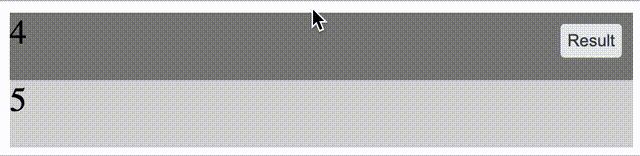
답변
.cont{
height: 100px;
overflow-x: hidden;
overflow-y: auto;
transform: rotate(180deg);
direction:rtl;
text-align:left;
}
ul{
overflow: hidden;
transform: rotate(180deg);
}
<div class="cont">
<ul>
<li>0</li>
<li>1</li>
<li>2</li>
<li>3</li>
<li>4</li>
<li>5</li>
<li>6</li>
<li>7</li>
<li>8</li>
<li>9</li>
<li>10</li>
</ul>
</div>-
Run code snippet효과를 볼 수 있습니다. (PS :Run code snippet작동하지 않으면 다음을 시도하십시오 : https://jsfiddle.net/Yeshen/xm2yLksu/3/ ) -
작동 방식 :
기본 오버플로는 위에서 아래로 스크롤됩니다.
transform: rotate(180deg) 스크롤하거나 동적 블록을 아래에서 위로 만들 수 있습니다.
- 독창적 인 아이디어 :
