아래와 같이 나타나는 CSS 플렉스 박스 레이아웃을 사용했습니다.

화면이 작아지면 다음과 같이 바뀝니다.
문제는 원본 이미지의 가로 세로 비율을 유지하면서 이미지 크기가 조정되지 않는다는 것입니다.
순수 CSS와 플렉스 박스 레이아웃을 사용하여 화면이 작아지면 이미지 크기를 조정할 수 있습니까?
내 HTML은 다음과 같습니다.
<div class="content">
  <div class="row">
    <div class="cell">
      <img src="http://i.imgur.com/OUla6mK.jpg"/>
    </div>
    <div class="cell">
      <img src="http://i.imgur.com/M16WzMd.jpg"/>
    </div>
  </div>
</div>
내 CSS :
.content {
    background-color: yellow;
}

.row {
    display: -webkit-box;
    display: -moz-box;
    display: -ms-flexbox;
    display: -webkit-flex;
    display: flex;

    -webkit-box-orient: horizontal;
    -moz-box-orient: horizontal;
    box-orient: horizontal;
    flex-direction: row;

    -webkit-box-pack: center;
    -moz-box-pack: center;
    box-pack: center;
    justify-content: center;

    -webkit-box-align: center;
    -moz-box-align: center;
    box-align: center;
    align-items: center;

    background-color: red;

}

.cell {
    -webkit-box-flex: 1;
    -moz-box-flex: 1;
    box-flex: 1;
    -webkit-flex: 1 1 auto;
    flex: 1 1 auto;

    padding: 10px;
    margin: 10px;

    background-color: green;
    border: 1px solid red;
    text-align: center;

}
답변
답변
나는 왜곡 된 이미지에 대한 답을 찾기 위해 여기에 왔습니다. 작업이 위에서 무엇을 찾고 있는지 완전히 확신하지 못했지만 추가 align-items: center하면 해결 된다는 것을 알았 습니다. 문서를 읽으면 align-items: stretch기본값 이므로 이미지를 직접 조정하는 경우이를 재정의하는 것이 좋습니다 . 또 다른 해결책은 먼저 div로 이미지를 래핑하는 것입니다.
.myFlexedImage {
  display: flex;
  flex-flow: row nowrap;
  align-items: center;
}
답변
답변
background-size이미지 크기를 조정하는 옵션을 살펴 보는 것이 좋습니다 .
배경 이미지로 설정 한 경우 페이지에 이미지가있는 대신 다음을 설정할 수 있습니다.
background-size: contain
또는
background-size: cover
이 옵션은 이미지 크기를 조정할 때 높이와 너비를 모두 고려합니다. 이것은 IE9 및 기타 모든 최신 브라우저에서 작동합니다.
답변
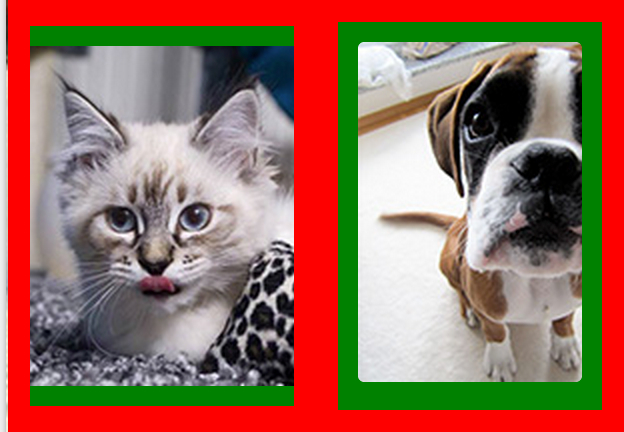
두 번째 이미지에서는 이미지가 상자를 채우고 싶은 것처럼 보이지만 생성 한 예제는 종횡비를 유지합니다 (애완 동물은 날씬하거나 뚱뚱하지 않고 정상적으로 보입니다).
예를 들어 이미지를 포토샵으로 찍었는지 아니면 두 번째 이미지도 “어떻게해야하는지”(당신은 IS라고 말했고 첫 번째 예는 “해야한다”라고 말 했음)
어쨌든, 나는 가정해야한다 :
“이미지가 가로 세로 비율을 유지하면서 크기가 조정되지 않고”픽셀의 가로 세로 비율을 유지하는 이미지를 표시하는 경우 “자르기”영역의 가로 세로 비율을 달성하려고한다고 가정해야합니다. 녹색) WILE은 픽셀의 종횡비를 유지합니다. 즉, 이미지를 확대하고 잘라내어 이미지로 셀을 채우려 고합니다.
이것이 문제인 경우 제공 한 코드는 “문제”가 아니라 시작 예제를 반영합니다.
앞의 두 가지 가정을 감안할 때 상자의 높이가 동적 인 경우 실제 이미지로 필요한 것을 달성 할 수 없지만 배경 이미지는 사용할 수 있습니다. “background-size : contain”또는 다음 기술 (원하는 곳에서 자르기 또는 최대 크기를 제한하는 스마트 패딩 (퍼센트))를 사용합니다.
http://fofwebdesign.co.uk/template/_testing/scale-img/scale- img.htm
이미지에서 이것이 가능한 유일한 방법은 두 번째 iimage를 잊어 버리고 셀의 높이가 고정되어 있고, 샘플 이미지로 판단하면 높이가 동일하게 유지되는 경우입니다!
따라서 컨테이너의 높이가 변경되지 않고 이미지를 정사각형으로 유지하려면 이미지의 최대 높이를 알려진 값으로 설정하면됩니다 (상자 크기 조정 속성에 따라 패딩 또는 테두리 제외). 세포)
이렇게 :
<div class="content">
  <div class="row">
      <div class="cell">
          <img src="http://lorempixel.com/output/people-q-c-320-320-2.jpg"/>
      </div>
      <div class="cell">
          <img src="http://lorempixel.com/output/people-q-c-320-320-7.jpg"/>
      </div>
    </div>
</div>
그리고 CSS :
.content {
    background-color: green;
}

.row {
    display: -webkit-box;
    display: -moz-box;
    display: -ms-flexbox;
    display: -webkit-flex;
    display: flex;

    -webkit-box-orient: horizontal;
    -moz-box-orient: horizontal;
    box-orient: horizontal;
    flex-direction: row;

    -webkit-box-pack: center;
    -moz-box-pack: center;
    box-pack: center;
    justify-content: center;

    -webkit-box-align: center;
    -moz-box-align: center;
    box-align: center;
    align-items: center;

}

.cell {
    -webkit-box-flex: 1;
    -moz-box-flex: 1;
    box-flex: 1;
    -webkit-flex: 1 1 auto;
    flex: 1 1 auto;
    padding: 10px;
    border: solid 10px red;
    text-align: center;
    height: 300px;
    display: flex;
    align-items: center;
    box-sizing: content-box;
}
img {
    margin: auto;
    width: 100%;
    max-width: 300px;
    max-height:100%
}코드가 유효하지 않습니다 (열기 태그는 닫는 태그 대신 사용되므로 형제가 아닌 NESTED 셀을 출력하고 결함이있는 코드 내에서 이미지의 SCREENSHOT을 사용했으며 플렉스 상자에는 셀이 아니라 두 예제가 모두 열에 있습니다 ( “행”을 설정했지만 한 셀을 다른 셀 내부에 중첩하는 손상된 코드로 인해 플렉스 내부에 플렉스가 발생하여 마침내 COLUMNS로 작동합니다. 무엇을 성취하고 싶었고 그 코드를 어떻게 생각해 냈는지 모르겠습니다. 당신이 원하는 게 이거 같아요.
디스플레이 : 플렉스도 셀에 추가하여 이미지가 중앙에 위치합니다 ( display: table이 모든 마크 업과 함께 여기에서도 사용될 수 있다고 생각합니다 ).
답변
HTML :
<div class="container">
    <div class="box">
        <img src="http://lorempixel.com/1600/1200/" alt="">
    </div>
</div>
CSS :
.container {
  display: flex;
  flex-direction: row;
  justify-content: center;
  align-items: stretch;

  width: 100%;
  height: 100%;

  border-radius: 4px;
  background-color: hsl(0, 0%, 96%);
}

.box {
  border-radius: 4px;
  display: flex;
}

.box img {
  width: 100%;
  object-fit: contain;
  border-radius: 4px;
}
답변
이것이 제가 유연한 그리드에서 다양한 이미지 (크기 및 비율)를 처리하는 방법입니다.
.images {
  display: flex;
  flex-wrap: wrap;
  margin: -20px;
}

.imagewrapper {
  display: flex;
  justify-content: center;
  align-items: center;
  width: calc(50% - 20px);
  height: 300px;
  margin: 10px;
}

.image {
  display: block;
  object-fit: cover;
  width: 100%;
  height: 100%; /* set to 'auto' in IE11 to avoid distortions */
}
<div class="images">
<div class="imagewrapper">
<img class="image" src="https://via.placeholder.com/800x600" />
</div>
<div class="imagewrapper">
<img class="image" src="https://via.placeholder.com/1024x768" />
</div>
<div class="imagewrapper">
<img class="image" src="https://via.placeholder.com/1000x800" />
</div>
<div class="imagewrapper">
<img class="image" src="https://via.placeholder.com/500x800" />
</div>
<div class="imagewrapper">
<img class="image" src="https://via.placeholder.com/800x600" />
</div>
<div class="imagewrapper">
<img class="image" src="https://via.placeholder.com/1024x768" />
</div>
</div>