다음과 같은 것이 필요합니다.
CSS로 어떻게 이것을 달성 할 수 있습니까? 한 가지 방법은 배경 이미지를 사용하는 것임을 알고 있지만 이미지없이 CSS로만 이것을 달성 할 수 있습니까?
답변
:before의사 요소를 사용하여이를 수행하는 해키 방법이 있습니다. 당신은 줄 :before다음 CSS 변환에게로 회전하는 국경을. 이렇게하면 DOM에 추가 요소가 추가되지 않으며 취소 선 추가 / 제거는 클래스를 추가 / 제거하는 것처럼 간단합니다.
주의 사항
- 이것은 IE8에서만 작동합니다. IE7은 지원하지 않습니다
:before그러나 브라우저에서 정상적으로 저하됩니다, 수행 지원:before하지만, CSS의 변환을 지원하지 않습니다. - 회전 각도가 고정됩니다. 텍스트가 더 길면 줄이 텍스트의 모서리에 닿지 않습니다. 이것을 명심하십시오.
CSS
.strikethrough {
  position: relative;
}
.strikethrough:before {
  position: absolute;
  content: "";
  left: 0;
  top: 50%;
  right: 0;
  border-top: 1px solid;
  border-color: inherit;

  -webkit-transform:rotate(-5deg);
  -moz-transform:rotate(-5deg);
  -ms-transform:rotate(-5deg);
  -o-transform:rotate(-5deg);
  transform:rotate(-5deg);
}
HTML
<span class="strikethrough">Deleted text</span>답변
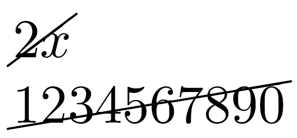
글꼴 색상을 하드 코딩하지 않도록 배경 linear-gradient을 사용할 수 있습니다 currentColor.
.strikediag {
  background: linear-gradient(to left top, transparent 47.75%, currentColor 49.5%, currentColor 50.5%, transparent 52.25%);
}
.withpadding {
  padding: 0 0.15em;
}
The value is <span class="strikediag">2x</span> 3x<br>
The number is <span class="strikediag">1234567890</span>.
<p>
The value is <span class="strikediag withpadding">2x</span>3x<br>
The number is <span class="strikediag withpadding">1234567890</span>.요소가 완전히 인라인 될 필요가없는 경우 의사 요소를 사용하여 요소 위에 줄을 배치 할 수 있습니다. 이렇게하면 의사 요소의 크기를 변경하여 각도를 조정할 수 있습니다.
.strikediag {
  display: inline-block;
  position: relative;
}
.strikediag::before {
  content: '';
  position: absolute;
  left: -0.1em;
  right: -0.1em;
  top: 0.38em;
  bottom: 0.38em;
  background: linear-gradient(to left top, transparent 45.5%, currentColor 47.5%, currentColor 52.5%, transparent 54.5%);
  pointer-events: none;
}
The value is <span class="strikediag">2x</span> 3x<br>
The number is <span class="strikediag">1234567890</span>.답변
del {
    position:relative;
    text-decoration:none;
}
del::after {
    content:"";
    position:absolute;
    top:50%; left:0; width:100%; height:1px;
    background:black;
    transform:rotate(-7deg);
}
답변
가로 룰에 회전 효과를 적용 할 수있을 것 같습니다. 다음과 같은 것 :
<html>
    <body>
        <hr />
        123456
    </body>
</html>
CSS 사용 :
HR
{
   width: 50px;
   position: absolute;
   background-color: #000000;
   color: #000000;
   border-color: #000000;
   transform:rotate(-7deg);
   -ms-transform:rotate(-7deg);
   -moz-transform:rotate(-7deg);
   -webkit-transform:rotate(-7deg);
   -o-transform:rotate(-7deg);
} 귀하의 마일리지는 브라우저 및 버전에 따라 다를 수 있으므로 여기에 의지 할 것인지 잘 모르겠습니다. 예를 들어 이전 버전의 IE를 지원하려면 펑키 한 VML 코드를 가져와야 할 수 있습니다.
답변
CSS3 그라디언트
background-image: linear-gradient(left bottom, rgb(234,20,136) 0%, rgb(255,46,164) 50%, rgb(255,74,197) 0%);
background-image: -o-linear-gradient(left bottom, rgb(234,20,136) 0%, rgb(255,46,164) 50%, rgb(255,74,197) 0%);
background-image: -moz-linear-gradient(left bottom, rgb(234,20,136) 0%, rgb(255,46,164) 50%, rgb(255,74,197) 0%);
background-image: -webkit-linear-gradient(left bottom, rgb(234,20,136) 0%, rgb(255,46,164) 50%, rgb(255,74,197) 0%);
background-image: -ms-linear-gradient(left bottom, rgb(234,20,136) 0%, rgb(255,46,164) 50%, rgb(255,74,197) 0%);

background-image: -webkit-gradient( linear, left bottom,right top,color-stop(0, rgb(234,20,136)), color-stop(0.5, rgb(255,46,164)), color-stop(0, rgb(255,74,197)) );
내 예제는 귀하의 요구를 완벽하게 채우지는 못하지만 더 많은 정보와 재미있는 조정은 http://gradients.glrzad.com/을 참조하십시오 .
당신이해야 할 것은 만드는 것입니다 background-gradient의를 white-black-white당신의 위치를 opacity같은에서 48% 50% 52%.
답변
이에 대한 지속 가능한 CSS 솔루션이 없다고 생각합니다.
내 순수한 CSS 솔루션은 문자 수 (문자는 ”)가 동일한 텍스트의 첫 번째 요소 뒤에 텍스트의 다른 요소를 배치하고, 줄을 통해 텍스트를 선언하고, 회전을 변환하는 것입니다.
다음과 같은 것 :
<html>
<head>
<style>
.strike{
 text-decoration: line-through;
-webkit-transform: rotate(344deg);
-moz-transform: rotate(344deg);
-o-transform: rotate(344deg);}
</style>
</head>
<body>
<p>Text to display</p>
<p class='strike'>               </p>
</body>다른 사용자의 더 나은 답변을 기대합니다.
답변
이것은 오래된 질문이지만 대안으로 CSS3 선형 그래디언트를 사용할 수 있습니다 ( http://codepen.io/yusuf-azer/pen/ojJLoG ).
광범위한 설명 및 LESS 솔루션 확인
http://www.yusufazer.com/tutorials-how-to/how-to-make-a-diagonal-line-through-with-css3/
span.price--line-through {
  background-color: transparent;
  background-image: -webkit-gradient(linear, 19.1% -7.9%, 81% 107.9%, color-stop(0, #fff), color-stop(.475, #fff), color-stop(.5, #000), color-stop(.515, #fff), color-stop(1, #fff));
  background-image: -webkit-repeating-linear-gradient(287deg, #fff 0%, #fff 47.5%, #000 50%, #fff 51.5%, #fff 100%);
  background-image: repeating-linear-gradient(163deg, #fff 0%, #fff 47.5%, #000 50%, #fff 51.5%, #fff 100%);
  background-image: -ms-repeating-linear-gradient(287deg, #fff 0%, #fff 47.5%, #000 50%, #fff 51.5%, #fff 100%);
} 