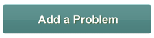
이 버튼 이미지가 있습니다.
<a href="">some words</a>그 링크가 그 버튼으로 나타나 도록 심플 하고 스타일리쉬 하게 만들 수 있을까?
가능하다면 어떻게해야합니까?
답변
CSS 사용 :
.button {
    display: block;
    width: 115px;
    height: 25px;
    background: #4E9CAF;
    padding: 10px;
    text-align: center;
    border-radius: 5px;
    color: white;
    font-weight: bold;
    line-height: 25px;
}
<a class="button">Add Problem</a>답변
Bootstrap의 문서를 확인하십시오 . 클래스 .btn가 존재하고 a태그 와 함께 작동 하지만 .btn-*클래스와 함께 특정 클래스 를 추가해야합니다 .btn.
예 : <a class="btn btn-info"></a>
답변
이렇게 링크로 버튼을 쉽게 감쌀 수 있습니다. <a href="#"> <button>my button </button> </a>
답변
다음은 버튼과 비슷합니다.
a.LinkButton {
  border-style: solid;
  border-width : 1px 1px 1px 1px;
  text-decoration : none;
  padding : 4px;
  border-color : #000000
}
예제는 http://jsfiddle.net/r7v5c/1/ 를 참조하십시오 .
답변
-
이 시도:
<link rel="stylesheet" href="https://maxcdn.bootstrapcdn.com/bootstrap/3.3.7/css/bootstrap.min.css"> <script src="https://ajax.googleapis.com/ajax/libs/jquery/3.3.1/jquery.min.js"></script> <script src="https://maxcdn.bootstrapcdn.com/bootstrap/3.3.7/js/bootstrap.min.js"></script> <div class="container"> <h2>Button Tags</h2> <a href="#" class="btn btn-info" role="button">Link Button</a> <button type="button" class="btn btn-info">Button</button> <input type="button" class="btn btn-info" value="Input Button"> <input type="submit" class="btn btn-info" value="Submit Button"> </div> -
href거기에서 태그 라인을 사용할 수 있습니다 .<a href="URL" class="btn btn-info" role="button">Button Text</a>
답변
CSS로 특정 디자인을 하드 코딩하는 것을 피하고 싶지만 브라우저의 기본 버튼에 의존하려면 다음 CSS를 사용할 수 있습니다.
a.button {
  -webkit-appearance: button;
  -moz-appearance: button;
  appearance: button;
}
IE에서는 작동하지 않을 것입니다.
답변
다른 답변은 링크 버튼이 마우스 오버시 모양을 변경하는 코드를 표시하지 않습니다.
이것은 내가 그것을 고치기 위해 한 일입니다.
HTML :
<a href="http://www.google.com" class="link_button2">My button</a>CSS :
.link_button2 {
  -webkit-border-radius: 4px;
  -moz-border-radius: 4px;
  border-radius: 4px;
  border: solid 1px #1A4575;
  text-shadow: 0 -1px 0 rgba(0, 0, 0, 0.4);
  -webkit-box-shadow: inset 0 1px 0 rgba(255, 255, 255, 0.4), 0 1px 1px rgba(0, 0, 0, 0.2);
  -moz-box-shadow: inset 0 1px 0 rgba(255, 255, 255, 0.4), 0 1px 1px rgba(0, 0, 0, 0.2);
  box-shadow: inset 0 1px 0 rgba(255, 255, 255, 0.4), 0 1px 1px rgba(0, 0, 0, 0.2);
  background: #3A68A1;
  color: #fee1cc;
  text-decoration: none;
  padding: 8px 12px;
  text-decoration: none;
  font-size: larger;
}

a.link_button2:hover {
  text-decoration: underline;
  background: #4479BA;
  border: solid 1px #20538D;

  /* optional different shadow on hover
  text-shadow: 0 -1px 0 rgba(0, 0, 0, 0.7);
  -webkit-box-shadow: inset 0 1px 0 rgba(255, 255, 255, 0.7), 0 1px 1px rgba(0, 0, 0, 0.4);
  -moz-box-shadow: inset 0 1px 0 rgba(255, 255, 255, 0.7), 0 1px 1px rgba(0, 0, 0, 0.4);
  box-shadow: inset 0 1px 0 rgba(255, 255, 255, 0.7), 0 1px 1px rgba(0, 0, 0, 0.4);
  */

}
JSFiddle :
https://jsfiddle.net/adamovic/ovu3k0cj/
