IconButton와 유사한 원을 만드는 방법을 보여주는 예를 찾을 수 없습니다 FloatingActionButton. 누구든지 같은 사용자 정의 버튼을 만드는 데 필요한 방법 / 무엇을 제안 할 수 있습니까 FloatingActionButton?
답변
RawMaterialButton이 더 적합하다고 생각합니다.
RawMaterialButton(
  onPressed: () {},
  elevation: 2.0,
  fillColor: Colors.white,
  child: Icon(
    Icons.pause,
    size: 35.0,
  ),
  padding: EdgeInsets.all(15.0),
  shape: CircleBorder(),
)
답변
이것을 시도해 볼 수 있으며 완전히 사용자 정의 할 수 있습니다.
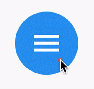
ClipOval(
  child: Material(
    color: Colors.blue, // button color
    child: InkWell(
      splashColor: Colors.red, // inkwell color
      child: SizedBox(width: 56, height: 56, child: Icon(Icons.menu)),
      onTap: () {},
    ),
  ),
)
산출:
답변
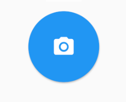
모양 만 사용하면됩니다. CircleBorder()
MaterialButton(
  onPressed: () {},
  color: Colors.blue,
  textColor: Colors.white,
  child: Icon(
    Icons.camera_alt,
    size: 24,
  ),
  padding: EdgeInsets.all(16),
  shape: CircleBorder(),
)
답변
InkWell 을 사용 하여 다음을 수행 할 수 있습니다 .
터치에 반응하는 머티리얼의 직사각형 영역입니다.
아래 예제는 InkWell. 주의 : 그렇게 할 필요가 없습니다 StatefulWidget. 카운트 상태를 변경하는 데 사용했습니다.
예:
import 'package:flutter/material.dart';
class SettingPage extends StatefulWidget {
@override
_SettingPageState createState() => new _SettingPageState();
}
class _SettingPageState extends State<SettingPage> {
int _count = 0;
@override
Widget build(BuildContext context) {
return new Scaffold(
body: new Center(
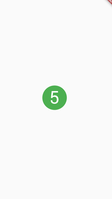
child: new InkWell(// this is the one you are looking for..........
onTap: () => setState(() => _count++),
child: new Container(
//width: 50.0,
//height: 50.0,
padding: const EdgeInsets.all(20.0),//I used some padding without fixed width and height
decoration: new BoxDecoration(
shape: BoxShape.circle,// You can use like this way or like the below line
//borderRadius: new BorderRadius.circular(30.0),
color: Colors.green,
),
child: new Text(_count.toString(), style: new TextStyle(color: Colors.white, fontSize: 50.0)),// You can add a Icon instead of text also, like below.
//child: new Icon(Icons.arrow_forward, size: 50.0, color: Colors.black38)),
),//............
),
),
);
}
}
splashColor,의 이점을 얻으려면 재료 유형이 원인 위젯을 사용하여 위젯을 highlightColor래핑하십시오 . 그런 다음 위젯 에서 제거하십시오 .InkWellMaterialdecorationContainer
결과:
답변
다음을 쉽게 수행 할 수 있습니다.
FlatButton(
      onPressed: () {

       },
      child: new Icon(
        Icons.arrow_forward,
        color: Colors.white,
        size: 20.0,
      ),
      shape: new CircleBorder(),
      color: Colors.black12,
    )
결과는
답변
RawMaterialButton(
  onPressed: () {},
  constraints: BoxConstraints(),
  elevation: 2.0,
  fillColor: Colors.white,
  child: Icon(
    Icons.pause,
    size: 35.0,
  ),
  padding: EdgeInsets.all(15.0),
  shape: CircleBorder(),
)
아래주의 constraints: BoxConstraints()가 왼쪽 패딩을 허용하지 않는위한거야.
행복한 설레임 !!
답변
배경 이미지가 필요한 경우 IconButton과 함께 CircleAvatar를 사용할 수 있습니다. backgroundImage 속성을 설정합니다.
CircleAvatar(
  backgroundImage: NetworkImage(userAvatarUrl),
)
버튼이있는 예 :
        CircleAvatar(
          backgroundColor: Colors.blue,
          radius: 20,
          child: IconButton(
            padding: EdgeInsets.zero,
            icon: Icon(Icons.add),
            color: Colors.white,
            onPressed: () {},
          ),
        ),

