stackoverflow 에서이 예제를 찾았습니다.
어느 것이 좋습니다. 그러나 원의 중간에 텍스트를 포함 할 수 있도록 예제를 수정하는 방법을 알고 싶습니다.
나는 또한 이것을 발견했다 : CSS에서 원의 수직 및 수평 중심 텍스트 (예 : iphone 알림 배지)
그러나 어떤 이유로 든 나를 위해 작동하지 않습니다. 다음 테스트 코드를 만들 때 :
<div class="badge">1</div>원 대신 타원형 모양을 얻습니다. 코드 작동 방법을 알아보기 위해 코드를 가지고 놀고 있습니다.
답변
.circle {
  width: 500px;
  height: 500px;
  border-radius: 50%;
  font-size: 50px;
  color: #fff;
  line-height: 500px;
  text-align: center;
  background: #000
}
<div class="circle">Hello I am A Circle</div>답변
콘텐츠가 줄 바꿈되어 높이를 알 수없는 경우 가장 좋은 방법입니다.
http://cssdeck.com/labs/aplvrmue
.badge {
  height: 100px;
  width: 100px;
  display: table-cell;
  text-align: center;
  vertical-align: middle;
  border-radius: 50%; /* may require vendor prefixes */
  background: yellow;
}
답변
css3을 사용할 수 있습니다 flexbox.
HTML :
<div class="circle-with-text">
    Here is some text in circle
</div>
CSS :
.circle-with-text {
  justify-content: center;
  align-items: center;
  border-radius: 100%;
  text-align: center;
  display: flex;
}
이렇게하면 세로 및 가로 가운데 정렬 된 한 줄과 여러 줄 텍스트를 가질 수 있습니다.
답변
타원형이나 원 안에 텍스트를 쓰고 싶습니까? 왜 이러지 않습니까?
<span style="border-radius:50%; border:solid black 1px;padding:5px">Hello</span>답변
웹 디자인을 위해 최근에 나는 고정 된 원 문제에서 중심에 있고 알 수없는 양의 텍스트를 해결해야했으며 원 / 텍스트 콤보를 보는 다른 사람들을 위해 여기에서 해결책을 공유 할 것이라고 생각했습니다.
내가 가진 주요 문제는 텍스트가 종종 원의 경계를 깰 수 있다는 것입니다. 이 문제를 해결하기 위해 4 div를 사용했습니다. 원의 최대 (고정) 경계를 지정한 하나의 직사각형 컨테이너. 그 안에는 너비와 높이가 100 %로 설정된 원을 그리는 div가 있으므로 부모의 크기를 변경하면 실제 원의 크기가 변경됩니다. 그 안에 %를 사용하여 텍스트가 원을 떠나는 것을 방지하는 텍스트 경계 영역을 만들 수있는 다른 직사각형 div가 있습니다. 마지막으로 텍스트와 수직 중심에 대한 실제 div입니다.
코드로 더 의미가 있습니다.
/* Main Container -  this controls the size of the circle */
.circle_container
{
	width : 128px;
	height : 128px;
	margin : 0;
	padding : 0;
/*	border : 1px solid red; */
}

/* Circle Main draws the actual circle */
.circle_main
{
	width : 100%;
	height : 100%;
	border-radius : 50%;
	border : 2px solid black;	/* can alter thickness and colour of circle on this line */
	margin : 0;
	padding : 0;
}

/* Circle Text Container - constrains text area to within the circle */
.circle_text_container
{
	/* area constraints */
	width : 70%;
	height : 70%;
	max-width : 70%;
	max-height : 70%;
	margin : 0;
	padding : 0;

	/* some position nudging to center the text area */
	position : relative;
	left : 15%;
	top : 15%;

	/* preserve 3d prevents blurring sometimes caused by the text centering in the next class */
	transform-style : preserve-3d;

	/*border : 1px solid green;*/
}

/* Circle Text - the appearance of the text within the circle plus vertical centering */
.circle_text
{
	/* change font/size/etc here */
	font: 11px "Tahoma", Arial, Serif;
	text-align : center;

	/* vertical centering technique */
	position : relative;
	top : 50%;
	transform : translateY(-50%);
}
<div class="circle_container">
<div class="circle_main">
<div class="circle_text_container">
<div class = "circle_text">
Here is an example of some text in my circle.
</div>
</div>
</div>
</div> 컨테이너 div에서 테두리 색상의 주석 처리를 제거하여 어떻게 제한되는지 확인할 수 있습니다.
알아 두어야 할 사항 : 너무 많은 텍스트를 넣거나 너무 긴 단어 / 깨지지 않은 텍스트를 사용하면 여전히 원의 경계를 벗어날 수 있습니다. 여전히 알려지지 않은 텍스트 (예 : 사용자 입력)에는 적합하지 않지만 저장해야 할 최대 텍스트 양이 무엇인지 모호하게 알고 원 크기와 글꼴 크기를 적절하게 설정하면 가장 잘 작동합니다. 물론 텍스트 컨테이너 div를 설정하여 오버플로를 숨길 수는 있지만 “깨진”것처럼 보일 수 있으며 실제로 디자인에서 최대 크기를 올바르게 대체하는 것은 아닙니다.
이것이 누군가에게 유용하기를 바랍니다! HTML / CSS는 나의 주요 분야가 아니므로 개선 될 수 있다고 확신합니다!
답변
HTML 태그와 CSS없이 텍스트가있는 원을 그립니다.
이를 위해 SVG 태그가있는 HTML. CSS를 사용하지 않으려는 경우이 표준 접근 방식을 따를 수 있습니다.
 <svg width="100" height="100">
   <circle cx="50" cy="50" r="40" stroke="green" stroke-width="4" fill="white" />
     Sorry, your browser does not support inline SVG.
   <text fill="#000000" font-size="18" font-family="Verdana"
     x="15" y="60">ASHISH</text>
 </svg>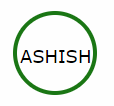
답변
한 줄의 텍스트 인 경우 요소 높이와 같은 값을 가진 line-height 속성을 사용할 수 있습니다.
height:100px;
line-height:100px;
텍스트에 여러 줄이 있거나 내용이 가변적 인 경우 패딩 상단을 사용할 수 있습니다.
padding-top:30px;
height:70px;