나는 일반적으로 CSS를 사용하여 바닥 글을 플러시하는 기술에 익숙합니다.
그러나 트위터 부트 스트랩에서 작동하기 위해이 방법을 사용하는 데 문제가 있습니다. 트위터 부트 스트랩이 본질적으로 반응하기 때문입니다. 트위터 부트 스트랩을 사용하여 위 블로그 게시물에 설명 된 접근 방식을 사용하여 바닥 글을 페이지 하단으로 플러시 할 수 없습니다.
답변
스 니펫 이 부트 스트랩에 실제로 잘 작동 한다는 것을 알았 습니다.
HTML :
<div id="wrap">
  <div id="main" class="container clear-top">
    <p>Your content here</p>
  </div>
</div>
<footer class="footer"></footer>
CSS :
html, body {
  height: 100%;
}

#wrap {
  min-height: 100%;
}

#main {
  overflow:auto;
  padding-bottom:150px; /* this needs to be bigger than footer height*/
}

.footer {
  position: relative;
  margin-top: -150px; /* negative value of footer height */
  height: 150px;
  clear:both;
  padding-top:20px;
}
답변
이것은 이제 Bootstrap 2.2.1에 포함되어 있습니다.
부트 스트랩 3.x
navbar 구성 요소를 사용하고 .navbar-fixed-bottom클래스를 추가하십시오 .
<div class="navbar navbar-fixed-bottom"></div>부트 스트랩 4.x
<div class="navbar fixed-bottom"></div>body { padding-bottom: 70px; }페이지 내용 을 추가 하거나 포함하는 것을 잊지 마십시오 .
문서 : http://getbootstrap.com/components/#navbar-fixed-bottom
답변
트위터 부트 스트랩 NOT STICKY FOOTER의 실례
<script>
$(document).ready(function() {

    var docHeight = $(window).height();
    var footerHeight = $('#footer').height();
    var footerTop = $('#footer').position().top + footerHeight;

    if (footerTop < docHeight)
        $('#footer').css('margin-top', 10+ (docHeight - footerTop) + 'px');
});
</script>
사용자가 devtools를 열거 나 창 크기를 조정할 때 항상 업데이트되는 버전입니다.
<script>
    $(document).ready(function() {
        setInterval(function() {
            var docHeight = $(window).height();
            var footerHeight = $('#footer').height();
            var footerTop = $('#footer').position().top + footerHeight;
            var marginTop = (docHeight - footerTop + 10);

            if (footerTop < docHeight)
                $('#footer').css('margin-top', marginTop + 'px'); // padding of 30 on footer
            else
                $('#footer').css('margin-top', '0px');
            // console.log("docheight: " + docHeight + "\n" + "footerheight: " + footerHeight + "\n" + "footertop: " + footerTop + "\n" + "new docheight: " + $(window).height() + "\n" + "margintop: " + marginTop);
        }, 250);
    });
</script>
최소한 요소가 필요합니다. #footer
내용이 화면에 맞으면 스크롤 막대를 원하지 않으면 값을 10으로 변경하십시오. 내용이 화면에 맞지 않으면
스크롤 막대가 나타납니다.
답변
공식 페이지에서이를 구현하는 방법은 다음과 같습니다.
http://getbootstrap.com/2.3.2/examples/sticky-footer.html
방금 테스트 한 결과 훌륭합니다! 🙂
HTML
<body>

    <!-- Part 1: Wrap all page content here -->
    <div id="wrap">

      <!-- Begin page content -->
      <div class="container">
        <div class="page-header">
          <h1>Sticky footer</h1>
        </div>
        <p class="lead">Pin a fixed-height footer to the bottom of the viewport in desktop browsers with this custom HTML and CSS.</p>
      </div>

      <div id="push"></div>
    </div>

    <div id="footer">
      <div class="container">
        <p class="muted credit">Example courtesy <a href="http://martinbean.co.uk">Martin Bean</a> and <a href="http://ryanfait.com/sticky-footer/">Ryan Fait</a>.</p>
      </div>
    </div>
</body>
관련 CSS 코드는 다음과 같습니다.
/* Sticky footer styles
-------------------------------------------------- */
html,
body {
    height: 100%;
    /* The html and body elements cannot have any padding or margin. */
}

/* Wrapper for page content to push down footer */
#wrap {
    min-height: 100%;
    height: auto !important;
    height: 100%;
    /* Negative indent footer by it's height */
    margin: 0 auto -30px;
}

/* Set the fixed height of the footer here */
#push,
#footer {
    height: 30px;
}

#footer {
    background-color: #f5f5f5;
}

/* Lastly, apply responsive CSS fixes as necessary */
@media (max-width: 767px) {
    #footer {
        margin-left: -20px;
        margin-right: -20px;
        padding-left: 20px;
        padding-right: 20px;
    }
}
답변
들어 스티커 바닥 글 우리는 두 가지를 사용하는 DIV's기본의 HTML에 끈적 끈적한 바닥 글 효과. 다음과 같이 작성하십시오.
HTML
<div class="container"></div>

<div class="footer"></div>
CSS
body,html {
    height:100%;
}
.container {
    min-height:100%;
}
.footer {
    height:40px;
    margin-top:-40px;
}
답변
훨씬 간단한 공식 예 : http://getbootstrap.com/examples/sticky-footer-navbar/
html {
  position: relative;
  min-height: 100%;
}
body {
  margin-bottom: 60px;
}
.footer {
  position: absolute;
  bottom: 0;
  width: 100%;
  height: 60px;
  background-color: #f5f5f5;
}
답변
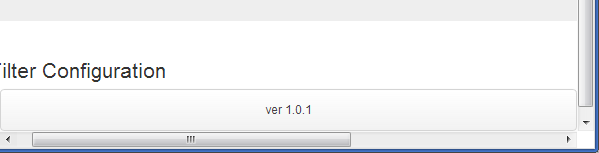
그럼 난의 혼합을 발견 navbar-inner하고 navbar-fixed-bottom
<div id="footer">
 <div class="navbar navbar-inner  navbar-fixed-bottom">
    <p class="muted credit"><center>ver 1.0.1</center></p>
 </div>
</div>
그것은 좋아 보이고 나를 위해 일합니다.
의 예를 참조하십시오 Fiddle
