CSS 참조에서 이미지 투명도 를 설정하는 방법 과 배경 이미지를 설정하는 방법을 볼 수 있습니다 . 그러나 투명한 배경 이미지를 설정하기 위해이 두 가지를 어떻게 결합 할 수 있습니까?
배경으로 사용하고 싶은 이미지가 있지만 너무 밝습니다. 불투명도를 약 0.2로 낮추고 싶습니다. 어떻게해야합니까?
#main {
    background-image: url(/wp-content/uploads/2010/11/tandem.jpg);
}
답변
두 가지 방법 :
- PNG로 변환하여 원본 이미지를 0.2 불투명도로 만듭니다
- (더 나은 방법)
<div>은position: absolute;이전#main과 높이가 같고#main배경 이미지 및을 적용하십시오opacity: 0.2; filter: alpha(opacity=20);.
답변
#main {
    position: relative;
}
#main:after {
    content : "";
    display: block;
    position: absolute;
    top: 0;
    left: 0;
    background-image: url(/wp-content/uploads/2010/11/tandem.jpg);
    width: 100%;
    height: 100%;
    opacity : 0.2;
    z-index: -1;
}
답변
1 div 및 투명한 이미지가없는 솔루션 :
다중 배경 CSS3 기능을 사용하고 두 개의 배경을 넣을 수 있습니다. 하나는 이미지가 있고 다른 하나는 투명 패널이 있습니다 (배경 이미지의 불투명도를 직접 설정할 방법이 없다고 생각합니다).
background: -moz-linear-gradient(top, rgba(0, 0, 0, 0.7) 0%, rgba(0, 0, 0, 0.7) 100%), url(bg.png) repeat 0 0, url(https://cdn.sstatic.net/stackoverflow/img/apple-touch-icon.png) repeat 0 0;

background: -moz-linear-gradient(top, rgba(255,255,255,0.7) 0%, rgba(255,255,255,0.7) 100%), url(https://cdn.sstatic.net/stackoverflow/img/apple-touch-icon.png) repeat 0 0;

background: -webkit-gradient(linear, left top, left bottom, color-stop(0%,rgba(255,255,255,0.7)), color-stop(100%,rgba(255,255,255,0.7))), url(https://cdn.sstatic.net/stackoverflow/img/apple-touch-icon.png) repeat 0 0;

background: -webkit-linear-gradient(top, rgba(255,255,255,0.7) 0%,rgba(255,255,255,0.7) 100%), url(https://cdn.sstatic.net/stackoverflow/img/apple-touch-icon.png) repeat 0 0;

background: -o-linear-gradient(top, rgba(255,255,255,0.7) 0%,rgba(255,255,255,0.7) 100%), url(https://cdn.sstatic.net/stackoverflow/img/apple-touch-icon.png) repeat 0 0;

background: -ms-linear-gradient(top, rgba(255,255,255,0.7) 0%,rgba(255,255,255,0.7) 100%), url(https://cdn.sstatic.net/stackoverflow/img/apple-touch-icon.png) repeat 0 0;

background: linear-gradient(to bottom, rgba(255,255,255,0.7) 0%,rgba(255,255,255,0.7) 100%), url(https://cdn.sstatic.net/stackoverflow/img/apple-touch-icon.png) repeat 0 0;rgba(255,255,255,0.5)혼자서만 사용할 수 있기 때문에 사용할 수 없으므로이 예제에서는 각 브라우저마다 생성 된 그라디언트를 사용했습니다 (그래서 너무 길습니다). 그러나 개념은 다음과 같습니다.
background: tranparentColor, url("myImage"); 답변
간단한 솔루션
그라디언트를 배경 이미지 로만 설정해야하는 경우 :
background-image: url(IMAGE_URL); /* fallback for older browsers */

background-image: linear-gradient(to bottom, rgba(0,0,0,0.6) 0%,rgba(0,0,0,0.6) 100%), url(IMAGE_URL);
답변
나는 이것을 보았고 CSS3에서는 이제 이와 같은 코드를 넣을 수 있습니다. 내가이 같은 일을 할 수있는 전체 배경을 덮고 싶다고합시다. 그런 다음 hsla(0,0%,100%,0.70)또는 rgba를 사용하면 원하는 모양을 얻기 위해 채도 또는 불투명도에 관계없이 흰색 배경을 사용합니다.
.body{
    background-attachment: fixed;
    background-image: url(../images/Store1.jpeg);
    display: block;
    position: absolute;
    left: 0;
    top: 0;
    width: 100%;
    height: 100%;
    z-index: 1;
    background-color: hsla(0,0%,100%,0.70);
    background-blend-mode: overlay;
    background-repeat: no-repeat;
}
답변
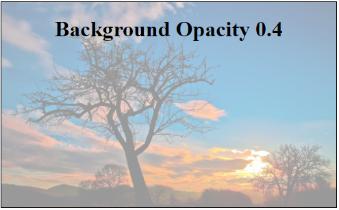
이것을 달성하기 위해 CSS psuedo selector :: after를 사용할 수 있습니다. 다음은 실제 데모입니다.
.bg-container{
  width: 100%;
  height: 300px;
  border: 1px solid #000;
  position: relative;
}
.bg-container .content{
  position: absolute;
  z-index:999;
  text-align: center;
  width: 100%;
}
.bg-container::after{
  content: "";
  position: absolute;
  top: 0px;
  left: 0px;
  width: 100%;
  height: 100%;
  z-index:-99;
  background-image: url(https://i.stack.imgur.com/Hp53k.jpg);
  background-size: cover;
  opacity: 0.4;
}
<div class="bg-container">
<div class="content">
<h1>Background Opacity 0.4</h1>
</div>
</div>답변
나는 비슷한 문제가 있었다. 나는 이미지를 가지고 투명도를 줄이고 이미지 뒤에 검은 배경을 갖기를 원했습니다. 불투명도를 줄이거 나 검은 배경 또는 보조 div를 만드는 대신 한 줄에 이미지의 선형 그라데이션을 설정했습니다.
background: linear-gradient(to bottom, rgba(0, 0, 0, 0.8) 0%, rgba(0, 0, 0, 0.8) 100%), url("/img/picture.png");