내 이미지를 ImageView테두리가있는 원형으로 만들고 싶습니다 .
나는 검색했지만 유용한 정보를 찾을 수 없었습니다 (내가 시도한 것이 작동하지 않았습니다).
xml을 통해 어떻게 이것을 달성 할 수 ImageView있습니까? 특정 src로를 만들고 테두리로 원형으로 만드십시오?
답변
흰색 테두리가있는 간단한 원과 모양이있는 투명한 내용을 만들 수 있습니다.
// res/drawable/circle.xml

<shape xmlns:android="http://schemas.android.com/apk/res/android"
    android:innerRadius="0dp"
    android:shape="ring"
    android:thicknessRatio="1.9"
    android:useLevel="false" >
    <solid android:color="@android:color/transparent" />

    <stroke
        android:width="10dp"
        android:color="@android:color/white" />
</shape>
그런 다음 레이어 목록을 드로어 블로 만들고 이미지 뷰의 배경으로 놓습니다.
// res/drawable/img.xml

<?xml version="1.0" encoding="utf-8"?>
<layer-list xmlns:android="http://schemas.android.com/apk/res/android" >

    <item android:drawable="@drawable/circle"/>
    <item android:drawable="@drawable/ic_launcher"/>

</layer-list>
이미지 뷰의 배경으로 사용하십시오.
   <ImageView
        android:layout_width="wrap_content"
        android:layout_height="wrap_content"
        android:background="@drawable/img"/>
당신은 그런 것을 가질 것입니다.

답변
이것이 내가 설계 한 가장 간단한 방법입니다. 이 시도.
dependencies: compile 'com.android.support:appcompat-v7:23.1.1'
              compile 'com.android.support:design:23.1.1'
              compile 'com.android.support:cardview-v7:23.1.1'

<android.support.v7.widget.CardView
    android:layout_width="80dp"
    android:layout_height="80dp"
    android:elevation="12dp"
    android:id="@+id/view2"
   app:cardCornerRadius="40dp"
    android:layout_centerHorizontal="true"
    android:innerRadius="0dp"
    android:shape="ring"
    android:thicknessRatio="1.9">
    <ImageView
        android:layout_height="80dp"
        android:layout_width="match_parent"
        android:id="@+id/imageView1"
        android:src="@drawable/YOUR_IMAGE"
        android:layout_alignParentTop="true"
        android:layout_centerHorizontal="true">
    </ImageView>
 </android.support.v7.widget.CardView>
롤리팝 이상의 안드로이드 버전으로 작업하는 경우
<android.support.v7.widget.CardView
android:layout_width="80dp"
android:layout_height="80dp"
android:elevation="12dp"
android:id="@+id/view2"
app:cardCornerRadius="40dp"
android:layout_centerHorizontal="true">
<ImageView
    android:layout_height="80dp"
    android:layout_width="match_parent"
    android:id="@+id/imageView1"
    android:src="@drawable/YOUR_IMAGE"
    android:scaleType="centerCrop"/>
  </android.support.v7.widget.CardView>
Round ImageView에 테두리 추가- 최신 버전
내부 CardView보다 약간 더 큰 다른 CardView로 감싸고 배경색을 설정하여 라운드 이미지에 테두리를 추가하십시오. 테두리의 두께를 늘리기 위해 외부 CardView의 크기를 늘릴 수 있습니다.
<androidx.cardview.widget.CardView
  android:layout_width="155dp"
  android:layout_height="155dp"
  app:cardCornerRadius="250dp"
  app:cardBackgroundColor="@color/white">

    <androidx.cardview.widget.CardView
      android:layout_width="150dp"
      android:layout_height="150dp"
      app:cardCornerRadius="250dp"
      android:layout_gravity="center">

        <ImageView
          android:layout_width="150dp"
          android:layout_height="150dp"
          android:src="@drawable/default_user"
          android:scaleType="centerCrop"/>

   </androidx.cardview.widget.CardView>

 </androidx.cardview.widget.CardView>
답변
이것이 도움이되기를 바랍니다.
1) CircleImageView

 <de.hdodenhof.circleimageview.CircleImageView
    xmlns:app="http://schemas.android.com/apk/res-auto"
    android:id="@+id/profile_image"
    android:layout_width="96dp"
    android:layout_height="96dp"
    android:src="@drawable/profile"
    app:civ_border_width="2dp"
    app:civ_border_color="#FF000000"/>
잊지 마라 구현 : Gradle Scripts> build.gradle (모듈 : app)> 의존성
implementation 'de.hdodenhof:circleimageview:3.1.0' 자세한 설명은 여기를 확인 하십시오.
2) CircularImageView

<com.mikhaellopez.circularimageview.CircularImageView
    android:layout_width="250dp"
    android:layout_height="250dp"
    android:src="@drawable/image"
    app:civ_border_color="#3f51b5"
    app:civ_border_width="4dp"
    app:civ_shadow="true"
    app:civ_shadow_radius="10"
    app:civ_shadow_color="#3f51b5"/>
잊지 마라 구현 : Gradle Scripts> build.gradle (모듈 : app)> 의존성
implementation 'com.mikhaellopez:circularimageview:4.2.0' 자세한 설명은 여기를 확인 하십시오.
답변
글라이드 라이브러리와 RoundedBitmapDrawableFactory 클래스 의 도움으로 쉽게 달성 할 수 있습니다. 원형 자리 표시 자 이미지를 만들어야 할 수도 있습니다.
글라이드 V4 :
Glide.with(context).load(url).apply(RequestOptions.circleCropTransform()).into(imageView);글라이드 V3 :
    Glide.with(context)
        .load(imgUrl)
        .asBitmap()
        .placeholder(R.drawable.placeholder)
        .error(R.drawable.placeholder)
        .into(new BitmapImageViewTarget(imgProfilePicture) {
            @Override
            protected void setResource(Bitmap resource) {
                RoundedBitmapDrawable drawable = RoundedBitmapDrawableFactory.create(context.getResources(),
                        Bitmap.createScaledBitmap(resource, 50, 50, false));
                drawable.setCircular(true);
                imgProfilePicture.setImageDrawable(drawable);
            }
        });
들어 피카소 RoundedTransformation ,이 위쪽 또는 아래쪽 가장자리 중 하나에 이미지를 반올림의 추가 옵션을 제공하는 정말 좋은 솔루션입니다.
답변
src속성을 사용하는 경우 위의 방법이 작동하지 않는 것 같습니다 . 내가 한 것은 다음과 같이 프레임 레이아웃 안에 두 개의 이미지보기를 배치하는 것입니다.
<FrameLayout android:id="@+id/frame"
             android:layout_width="40dp"
             android:layout_height="40dp">

    <ImageView android:id="@+id/pic"
               android:layout_width="40dp"
               android:layout_height="40dp"
               android:src="@drawable/my_picture" />

    <ImageView android:id="@+id/circle_crop"
               android:layout_width="40dp"
               android:layout_height="40dp"
               android:src="@drawable/circle_crop" />

</FrameLayout>
흰색 배경과 가운데에 투명한 원이있는 이미지 크기 (제 경우 사각형) 모양의 drawable 폴더에 circle_crop.png를 넣으십시오. 정사각형 이미지 뷰를 원하면이 이미지를 사용할 수 있습니다.

위의 그림을 다운로드하십시오.
답변
다음은 가장 간단한 방법 중 하나입니다. 다음 코드를 사용하십시오.
의존성
dependencies {
    ...
    compile 'de.hdodenhof:circleimageview:2.1.0'      // use this or use the latest compile version. In case u get bug.
}
XML 코드
<de.hdodenhof.circleimageview.CircleImageView
xmlns:app="http://schemas.android.com/apk/res-auto"
android:id="@+id/profile_image"
android:layout_width="96dp" // here u can adjust the width
android:layout_height="96dp" // here u can adjust the height
android:src="@drawable/profile" // here u can change the image
app:civ_border_width="2dp" // here u can adjust the border of the circle.
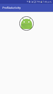
app:civ_border_color="#FF000000"/> // here u can adjust the border color스크린 샷 :
출처 : Circular ImageView GitHub 리포지토리

답변
이것은 트릭을 할 것입니다 :
rectangle.xml
<?xml version="1.0" encoding="UTF-8"?>
<shape xmlns:android="http://schemas.android.com/apk/res/android"
    android:shape="rectangle">
    <solid android:color="@android:color/transparent" />
    <padding android:bottom="-14dp" android:left="-14dp" android:right="-14dp" android:top="-14dp" />

</shape>
circle.xml
<shape xmlns:android="http://schemas.android.com/apk/res/android"
    android:innerRadius="0dp"
    android:shape="oval"

    android:useLevel="false" >
    <solid android:color="@android:color/transparent" />

    <stroke
        android:width="15dp"
        android:color="@color/verification_contact_background" />

</shape>
profile_image.xml (레이어 목록)
<?xml version="1.0" encoding="utf-8"?>
<layer-list xmlns:android="http://schemas.android.com/apk/res/android" >

    <item android:drawable="@drawable/rectangle" />
    <item android:drawable="@drawable/circle"/>

</layer-list>
레이아웃
 <ImageView
        android:id="@+id/profile_image"
        android:layout_width="match_parent"
        android:layout_height="match_parent"
        android:background="@drawable/default_org"
        android:src="@drawable/profile_image"/>