overflow: auto;속성 때문에 드롭 다운이 표시되지 않기 때문에 응답하고 스크롤 할 때 테이블 내부의 드롭 다운 버튼에 문제가 있습니다 . 버튼이 축소되었을 때 드롭 다운 옵션을 표시하려면 어떻게해야합니까? 일부 jQuery를 사용할 수 있지만 왼쪽에서 오른쪽으로 스크롤하는 데 문제가 있으므로 다른 솔루션을 찾기로 결정했습니다. 더 잘 이해하기 위해 사진을 첨부했습니다.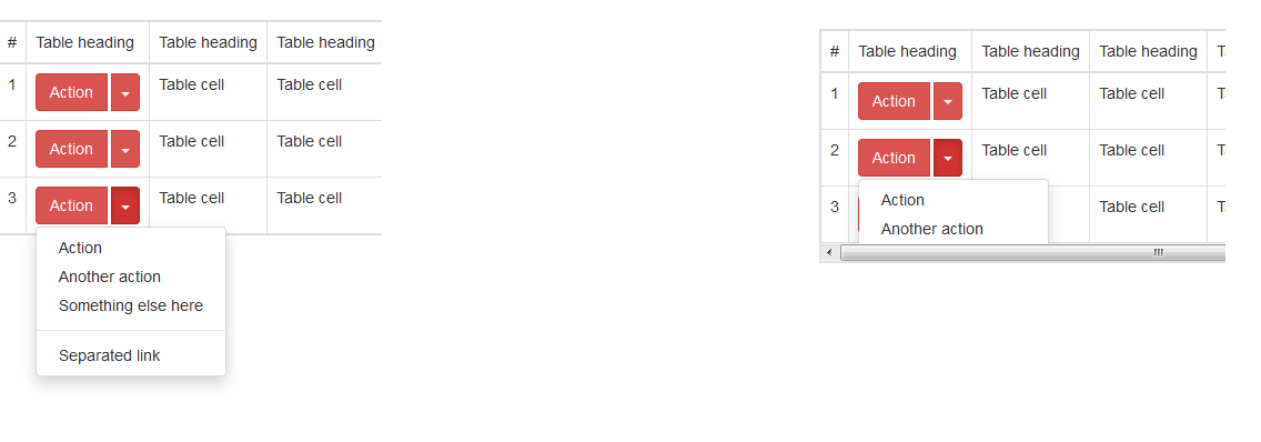
답변
나는 이것을 스스로 해결했고 동일한 문제를 가진 다른 사용자를 돕기 위해 답변을 범위에 넣었습니다. 부트 스트랩에 이벤트가 있으며 해당 이벤트를 사용하여 설정할 수 overflow: inherit있지만 부모에 CSS 속성이 없으면 작동합니다. 컨테이너.
$('.table-responsive').on('show.bs.dropdown', function () {
     $('.table-responsive').css( "overflow", "inherit" );
});

$('.table-responsive').on('hide.bs.dropdown', function () {
     $('.table-responsive').css( "overflow", "auto" );
})
info: 이 바이올린 예제에서 이상하게 작동하고 왜 그런지 모르겠지만 내 프로젝트에서는 잘 작동합니다.
답변
CSS 유일한 해결책은 오버플로 y 축을 허용한다.
http://www.bootply.com/YvePJTDzI0
.table-responsive {
  overflow-y: visible !important;
}
편집하다
또 다른 CSS 유일한 해결책은 뷰포트 너비에 따라 오버플로를 반응 적으로 적용하는 것입니다.
@media (max-width: 767px) {
    .table-responsive .dropdown-menu {
        position: static !important;
    }
}
@media (min-width: 768px) {
    .table-responsive {
        overflow: inherit;
    }
}
답변
참고로 2018 년이고 BS4.1을 사용하고 있습니다.
data-boundary="viewport"드롭 다운을 토글하는 버튼 (클래스가있는 버튼)에 추가해보세요 dropdown-toggle. https://getbootstrap.com/docs/4.1/components/dropdowns/#options를 참조 하십시오.
답변
나는 다른 접근 방식을 취했고 부모에서 요소를 분리하고 jQuery에 의해 절대 위치로 설정했습니다.
작동하는 JS 파일 :
http://jsfiddle.net/s270Lyrd/
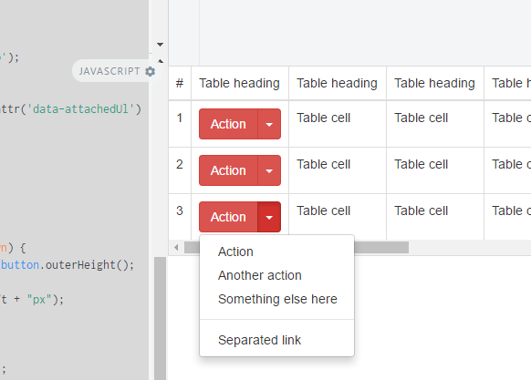
내가 사용하고있는 JS 솔루션.
//fix menu overflow under the responsive table
// hide menu on click... (This is a must because when we open a menu )
$(document).click(function (event) {
    //hide all our dropdowns
    $('.dropdown-menu[data-parent]').hide();

});
$(document).on('click', '.table-responsive [data-toggle="dropdown"]', function () {
    // if the button is inside a modal
    if ($('body').hasClass('modal-open')) {
        throw new Error("This solution is not working inside a responsive table inside a modal, you need to find out a way to calculate the modal Z-index and add it to the element")
        return true;
    }

    $buttonGroup = $(this).parent();
    if (!$buttonGroup.attr('data-attachedUl')) {
        var ts = +new Date;
        $ul = $(this).siblings('ul');
        $ul.attr('data-parent', ts);
        $buttonGroup.attr('data-attachedUl', ts);
        $(window).resize(function () {
            $ul.css('display', 'none').data('top');
        });
    } else {
        $ul = $('[data-parent=' + $buttonGroup.attr('data-attachedUl') + ']');
    }
    if (!$buttonGroup.hasClass('open')) {
        $ul.css('display', 'none');
        return;
    }
    dropDownFixPosition($(this).parent(), $ul);
    function dropDownFixPosition(button, dropdown) {
        var dropDownTop = button.offset().top + button.outerHeight();
        dropdown.css('top', dropDownTop + "px");
        dropdown.css('left', button.offset().left + "px");
        dropdown.css('position', "absolute");

        dropdown.css('width', dropdown.width());
        dropdown.css('heigt', dropdown.height());
        dropdown.css('display', 'block');
        dropdown.appendTo('body');
    }
});
답변
이 솔루션은 저에게 효과적이었습니다.
@media (max-width: 767px) {
    .table-responsive .dropdown-menu {
        position: static !important;
    }
}
@media (min-width: 768px) {
    .table-responsive {
        overflow: visible;
    }
}
답변
내 2 ¢ 빠른 글로벌 수정 :
// drop down in responsive table

(function () {
  $('.table-responsive').on('shown.bs.dropdown', function (e) {
    var $table = $(this),
        $menu = $(e.target).find('.dropdown-menu'),
        tableOffsetHeight = $table.offset().top + $table.height(),
        menuOffsetHeight = $menu.offset().top + $menu.outerHeight(true);

    if (menuOffsetHeight > tableOffsetHeight)
      $table.css("padding-bottom", menuOffsetHeight - tableOffsetHeight);
  });

  $('.table-responsive').on('hide.bs.dropdown', function () {
    $(this).css("padding-bottom", 0);
  })
})();
설명 : ‘.table-responsive’내에 드롭 다운 메뉴가 표시되면 테이블의 높이를 계산하고 메뉴를 표시하는 데 필요한 높이와 일치하도록 확장 (패딩 포함)합니다. 메뉴는 모든 크기가 될 수 있습니다.
제 경우에는 ‘.table-responsive’클래스가있는 테이블이 아니라 래핑 div입니다.
<div class="table-responsive" style="overflow:auto;">
    <table class="table table-hover table-bordered table-condensed server-sort">
따라서 스크립트의 $ table var는 실제로 div입니다! (단지 명확하게 … 또는 아닙니다) 🙂
참고 : IDE에서 함수를 축소 할 수 있도록 함수로 래핑하지만 필수는 아닙니다!
답변
CSS 만 사용하는 솔루션이 있으며 테이블 응답 내부의 드롭 다운에 대해 위치 상대를 사용하십시오.
@media (max-width: 767px) {
  .table-responsive .dropdown-menu {
    position: relative; /* Sometimes needs !important */
  }
}
