CSS로이 이미지를 다시 만들려고합니다.
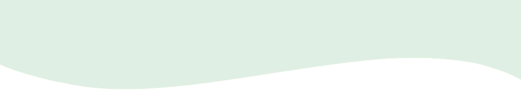
반복 할 필요가 없습니다. 이것은 내가 시작한 것이지만 직선이 있습니다.
#wave {
  position: absolute;
  height: 70px;
  width: 600px;
  background: #e0efe3;
}<div id="wave"></div>답변
나는 그것이 당신의 모양인지 확실하지 않지만 가깝습니다. 값을 가지고 놀 수 있습니다.
#wave {
  position: relative;
  height: 70px;
  width: 600px;
  background: #e0efe3;
}
#wave:before {
  content: "";
  display: block;
  position: absolute;
  border-radius: 100% 50%;
  width: 340px;
  height: 80px;
  background-color: white;
  right: -5px;
  top: 40px;
}
#wave:after {
  content: "";
  display: block;
  position: absolute;
  border-radius: 100% 50%;
  width: 300px;
  height: 70px;
  background-color: #e0efe3;
  left: 0;
  top: 27px;
}<div id="wave"></div>답변
원하는 모양을 만드는 올바른 방법이라고 생각합니다. SVG 가능성과 컨테이너를 사용하여 모양을 반응 형으로 유지합니다.
svg {
  display: inline-block;
  position: absolute;
  top: 0;
  left: 0;
}
.container {
  display: inline-block;
  position: relative;
  width: 100%;
  padding-bottom: 100%;
  vertical-align: middle;
  overflow: hidden;
}<div class="container">
<svg viewBox="0 0 500 500" preserveAspectRatio="xMinYMin meet">
<path d="M0,100 C150,200 350,0 500,100 L500,00 L0,0 Z" style="stroke: none; fill:red;"></path>
</svg>
</div>답변
내 구현은 html의 svg 요소를 사용하며 원하는 웨이브를 만들기위한 생성기를 만들었습니다.
https://smooth.ie/blogs/news/svg-wavey-transitions-between-sections
<div style="height: 150px; overflow: hidden;">
  <svg viewBox="0 0 500 150" preserveAspectRatio="none" style="height: 100%; width: 100%;">
    <path d="M0.00,92.27 C216.83,192.92 304.30,8.39 500.00,109.03 L500.00,0.00 L0.00,0.00 Z" style="stroke: none;fill: #e1efe3;"></path>
  </svg>
</div>
https://jsfiddle.net/1b8L7nax/5/
답변
위의 100 % 너비를 기반으로하는 순수한 CSS 구현입니다. 도움이 되었기를 바랍니다.
답변
나는 ThomasA의 대답을 좋아하지만 두 개의 div를 분리하는 데 사용되는 웨이브로 더 현실적인 컨텍스트를 원했습니다. 그래서 나는 더 완전한 분리기 SVG가 두 div 사이에 완벽하게 배치되는 데모를 .
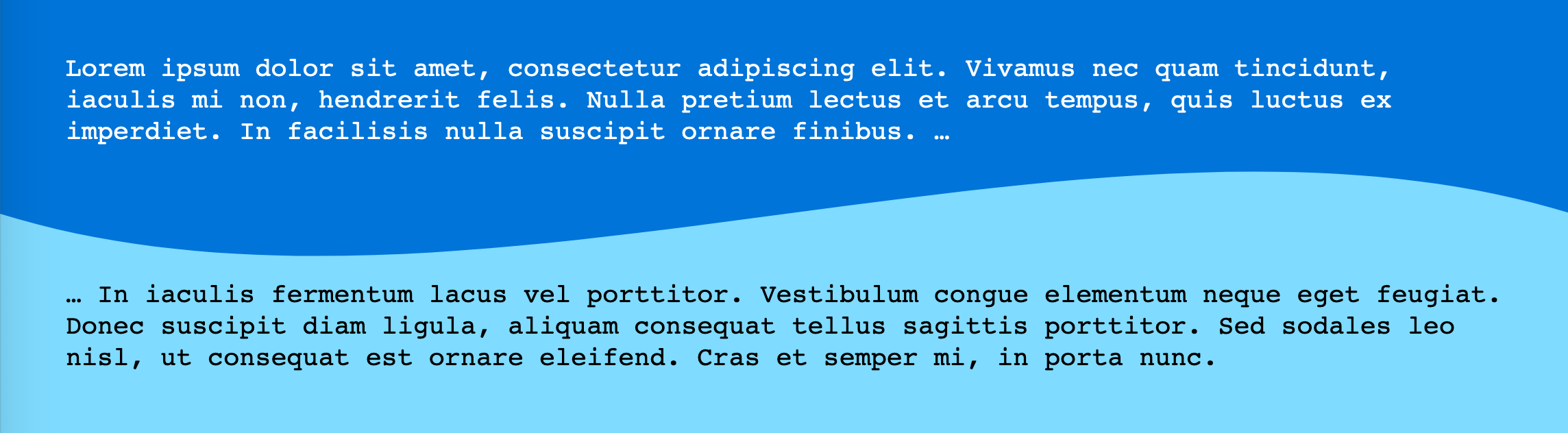
이제 더 나아가는 것이 멋질 것이라고 생각했습니다. 인라인 SVG없이 CSS에서이 모든 작업을 수행 할 수 있다면 어떨까요? 요점은 추가 마크 업을 피하는 것입니다. 내가 한 방법은 다음과 같습니다.
두 가지 간단합니다 <div>.
/** CSS using pseudo-elements: **/

#A {
  background: #0074D9;
}

#B {
  background: #7FDBFF;
}

#A::after {
  content: "";
  position: relative;
  left: -3rem;
  /* padding * -1 */
  top: calc( 3rem - 4rem / 2);
  /* padding - height/2 */
  float: left;
  display: block;
  height: 4rem;
  width: 100vw;
  background: hsla(0, 0%, 100%, 0.5);
  background-image: url("data:image/svg+xml,%3Csvg xmlns='http://www.w3.org/2000/svg' viewBox='0 70 500 60' preserveAspectRatio='none'%3E%3Crect x='0' y='0' width='500' height='500' style='stroke: none; fill: %237FDBFF;' /%3E%3Cpath d='M0,100 C150,200 350,0 500,100 L500,00 L0,0 Z' style='stroke: none; fill: %230074D9;'%3E%3C/path%3E%3C/svg%3E");
  background-size: 100% 100%;
}


/** Cosmetics **/

* {
  margin: 0;
}

#A,
#B {
  padding: 3rem;
}

div {
  font-family: monospace;
  font-size: 1.2rem;
  line-height: 1.2;
}

#A {
  color: white;
}<div id="A">Lorem ipsum dolor sit amet, consectetur adipiscing elit. Vivamus nec quam tincidunt, iaculis mi non, hendrerit felis. Nulla pretium lectus et arcu tempus, quis luctus ex imperdiet. In facilisis nulla suscipit ornare finibus. …
</div>
<div id="B" class="wavy">… In iaculis fermentum lacus vel porttitor. Vestibulum congue elementum neque eget feugiat. Donec suscipit diam ligula, aliquam consequat tellus sagittis porttitor. Sed sodales leo nisl, ut consequat est ornare eleifend. Cras et semper mi, in porta nunc.</div>데모 물결 모양 구분선 (추가 마크 업을 피하기 위해 CSS 의사 요소 포함)
인라인 SVG보다 위치 지정이 약간 까다로 웠지만 잘 작동합니다. (높이와 패딩을 읽기 쉽게 유지하기 위해 CSS 사용자 정의 속성 또는 전 처리기 변수를 사용할 수 있습니다.)
색상을 편집하려면 URL 인코딩 된 SVG 자체를 편집해야합니다.
첫 번째 데모 에서와 같이viewBoxSVG에서 원하지 않는 공간을 제거하기 위해 . (또 다른 옵션은 다른 SVG를 그리는 것입니다.)
여기서주의해야 할 또 다른 점 은 양방향으로 늘어나 도록 background-size설정하는 100% 100%것입니다.
답변
최근에 Get Waves라는 멋진 도구가 도입되어 UI에서 간단히 자신의 웨이브를 만든 다음이를 SVG 형식으로 내보낼 수 있습니다. https://getwaves.io/ 웹 사이트 로 이동하여 즐기는 것만 큼 간단 합니다!
편집하다:
최근에 나는 새로운 도구도 발견했습니다-https: //shapedivider.app/
답변
여기에 또 다른 방법이 있습니다. 🙂 개념은 웨이브를 한쪽으로 사용하여 클립 경로 다각형을 만드는 것입니다.
이 접근 방식은 상당히 유연합니다. 웨이브가 나타나는 위치 (왼쪽, 오른쪽, 위 또는 아래)를 변경하고 웨이브 함수를 [0,1]에 매핑되는 함수 (t)로 변경할 수 있습니다. 다각형은 ‘왼쪽’또는 ‘오른쪽’방향 일 때 물결 주위로 텍스트가 흐르도록하는 모양 외부에도 사용할 수 있습니다.
마지막으로 웨이브 애니메이션을 보여주는 예제의 주석을 제거 할 수 있습니다.
function PolyCalc(f /*a function(t)  from [0, infinity) => [0, 1]*/,
                  s, /*a slice function(y, i) from y [0,1] => [0, 1], with slice index, i, in [0, n]*/
									w /*window size in seconds*/,
                  n /*sample size*/,
                  o /*orientation => left/right/top/bottom - the 'flat edge' of the polygon*/
                  )
{
	this.polyStart = "polygon(";
  this.polyLeft = this.polyStart + "0% 0%, "; //starts in the top left corner
  this.polyRight = this.polyStart + "100% 0%, "; //starts in the top right corner
  this.polyTop = this.polyStart + "0% 0%, "; // starts in the top left corner
  this.polyBottom = this.polyStart + "0% 100%, ";//starts in the bottom left corner

  var self = this;
  self.mapFunc = s;
  this.func = f;
  this.window = w;
  this.count = n;
  var dt = w/n;

  switch(o) {
    case "top":
      this.poly = this.polyTop; break;
    case "bottom":
      this.poly = this.polyBottom; break;
  	case "right":
    	this.poly = this.polyRight; break;
  	case "left":
  	default:
  		this.poly = this.polyLeft; break;
    }

  this.CalcPolygon = function(t) {
  	var p = this.poly;
    for (i = 0; i < this.count; i++) {
      x = 100 * i/(this.count-1.0);
      y = this.func(t + i*dt);
      if (typeof self.mapFunc !== 'undefined')
      	y=self.mapFunc(y, i);
      y*=100;
      switch(o) {
        case "top":
          p += x + "% " + y + "%, "; break;
        case "bottom":
          p += x + "% " + (100-y) + "%, "; break;
      	case "right":
        	p += (100-y) + "% " + x + "%, "; break;
      	case "left":
        default:
        	p += y + "% " + x + "%, "; break;
      }
    }

    switch(o) {
      case "top":
        p += "100% 0%)"; break;
      case "bottom":
        p += "100% 100%)";
        break;
    	case "right":
      	p += "100% 100%)"; break;
    	case "left":
      default:
      	p += "0% 100%)"; break;
    }

    return p;
  }
};

var text = document.querySelector("#text");
var divs = document.querySelectorAll(".wave");
var freq=2*Math.PI; //angular frequency in radians/sec
var windowWidth = 1; //the time domain window which determines the range from [t, t+windowWidth] that will be evaluated to create the polygon
var sampleSize = 60;
divs.forEach(function(wave) {
  var loc = wave.classList[1];

  var polyCalc = new PolyCalc(
	  function(t) { //The time domain wave function
  	  return (Math.sin(freq * t) + 1)/2; //sine is [-1, -1], so we remap to [0,1]
    },
    function(y, i) { //slice function, takes the time domain result and the slice index and returns a new value in [0, 1]
      return MapRange(y, 0.0, 1.0, 0.65, 1.0);  //Here we adjust the range of the wave to 'flatten' it out a bit.  We don't use the index in this case, since it is irrelevant
    },
    windowWidth, //1 second, which with an angular frequency of 2pi rads/sec will produce one full period.
    sampleSize, //the number of samples to make, the larger the number, the smoother the curve, but the more pionts in the final polygon
    loc //the location
  );

    var polyText = polyCalc.CalcPolygon(0);
    wave.style.clipPath = polyText;
    wave.style.shapeOutside = polyText;
    wave.addEventListener("click",function(e) {document.querySelector("#polygon").innerText = polyText;});
  });

function MapRange(value, min, max, newMin, newMax) {
  return value * (newMax - newMin)/(max-min) + newMin;
}

//Animation - animate the wave by uncommenting this section
//Also demonstrates a slice function which uses the index of the slice to alter the output for a dampening effect.
/*
var t = 0;
var speed = 1/180;

var polyTop = document.querySelector(".top");

var polyTopCalc = new PolyCalc(
	  function(t) {
  	  return (Math.sin(freq * t) + 1)/2;
    },
    function(y, i) {
      return MapRange(y, 0.0, 1.0, (sampleSize-i)/sampleSize, 1.0);
    },
    windowWidth, sampleSize, "top"
  );

function animate() {
		var polyT = polyTopCalc.CalcPolygon(t);
    t+= speed;
    polyTop.style.clipPath = polyT;
    requestAnimationFrame(animate);
}

requestAnimationFrame(animate);
*/
div div {
padding:10px;
/*overflow:scroll;*/
}
.left {
height:100%;
width:35%;
float:left;
}
.right {
height:200px;
width:35%;
float:right;
}
.top {
width:100%;
height: 200px;
}
.bottom {
width:100%;
height:200px;
}
.green {
background:linear-gradient(to bottom, #b4ddb4 0%,#83c783 17%,#52b152 33%,#008a00 67%,#005700 83%,#002400 100%);
}
.mainContainer {
width:100%;
float:left;
}
#polygon {
padding-left:20px;
margin-left:20px;
width:100%;
}<div class="mainContainer">
<div class="wave top green">
Click to see the polygon CSS
</div>
<!--div class="wave left green">
</div-->
<!--div class="wave right green">
</div-->
<!--div class="wave bottom green"></div-->
</div>
<div id="polygon"></div>