SwiftUI에 전체 화면 활동 표시기를 추가하려고합니다.
.overlay(overlay: )기능을 사용할 수 있습니다View프로토콜 .
이와 함께, 나는 어떤보기 오버레이를 만들 수 있습니다,하지만 난 아이폰 OS의 기본 스타일을 찾을 수 UIActivityIndicatorView에 해당 SwiftUI.
기본 스타일 스피너를 SwiftUI어떻게 만들 수 있습니까?
참고 : 이것은 UIKit 프레임 워크에서 활동 표시기를 추가하는 것이 아닙니다.
답변
현재 엑스 코드 (12) 베타 ( 아이폰 OS 14 )라는 새로운보기 ProgressView이다 개발자에게 제공 하고, 그 확정 및 불확정 진행을 모두 표시 할 수 있습니다.
그것의 스타일은 기본적으로 CircularProgressViewStyle우리가 찾고있는 것입니다.
var body: some View {
    VStack {
        ProgressView()
           // and if you want to be explicit / future-proof...
           // .progressViewStyle(CircularProgressViewStyle())
    }
}
Xcode 11.x
꽤 많은 뷰가 아직에서 표시되지 않지만 SwiftUI시스템에 쉽게 이식 할 수 있습니다. 당신 UIActivityIndicator은 그것을 포장 하고 만들어야합니다 UIViewRepresentable.
(이에 대한 자세한 내용은 우수한 WWDC 2019 토크 -SwiftUI 통합 에서 찾을 수 있습니다. )
struct ActivityIndicator: UIViewRepresentable {

    @Binding var isAnimating: Bool
    let style: UIActivityIndicatorView.Style

    func makeUIView(context: UIViewRepresentableContext<ActivityIndicator>) -> UIActivityIndicatorView {
        return UIActivityIndicatorView(style: style)
    }

    func updateUIView(_ uiView: UIActivityIndicatorView, context: UIViewRepresentableContext<ActivityIndicator>) {
        isAnimating ? uiView.startAnimating() : uiView.stopAnimating()
    }
}
그런 다음 다음과 같이 사용할 수 있습니다. 여기 로딩 오버레이의 예가 있습니다.
참고 : 내가 사용을 선호 ZStack하기보다는, overlay(:_)내 구현에서 일어나는 정확히 알 수 있도록.
struct LoadingView<Content>: View where Content: View {

    @Binding var isShowing: Bool
    var content: () -> Content

    var body: some View {
        GeometryReader { geometry in
            ZStack(alignment: .center) {

                self.content()
                    .disabled(self.isShowing)
                    .blur(radius: self.isShowing ? 3 : 0)

                VStack {
                    Text("Loading...")
                    ActivityIndicator(isAnimating: .constant(true), style: .large)
                }
                .frame(width: geometry.size.width / 2,
                       height: geometry.size.height / 5)
                .background(Color.secondary.colorInvert())
                .foregroundColor(Color.primary)
                .cornerRadius(20)
                .opacity(self.isShowing ? 1 : 0)

            }
        }
    }

}
이를 테스트하기 위해 다음 예제 코드를 사용할 수 있습니다.
struct ContentView: View {

    var body: some View {
        LoadingView(isShowing: .constant(true)) {
            NavigationView {
                List(["1", "2", "3", "4", "5"], id: \.self) { row in
                    Text(row)
                }.navigationBarTitle(Text("A List"), displayMode: .large)
            }
        }
    }

}
결과:
답변
신속한 UI 스타일의 솔루션 을 원한다면 이것이 마법입니다.
import SwiftUI

struct ActivityIndicator: View {

  @State private var isAnimating: Bool = false

  var body: some View {
    GeometryReader { (geometry: GeometryProxy) in
      ForEach(0..<5) { index in
        Group {
          Circle()
            .frame(width: geometry.size.width / 5, height: geometry.size.height / 5)
            .scaleEffect(!self.isAnimating ? 1 - CGFloat(index) / 5 : 0.2 + CGFloat(index) / 5)
            .offset(y: geometry.size.width / 10 - geometry.size.height / 2)
          }.frame(width: geometry.size.width, height: geometry.size.height)
            .rotationEffect(!self.isAnimating ? .degrees(0) : .degrees(360))
            .animation(Animation
              .timingCurve(0.5, 0.15 + Double(index) / 5, 0.25, 1, duration: 1.5)
              .repeatForever(autoreverses: false))
        }
      }
    .aspectRatio(1, contentMode: .fit)
    .onAppear {
        self.isAnimating = true
    }
  }
}
사용하기 :
ActivityIndicator()
.frame(width: 50, height: 50)
도움이 되었기를 바랍니다.
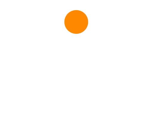
사용 예 :
ActivityIndicator()
.frame(size: CGSize(width: 200, height: 200))
    .foregroundColor(.orange)
답변
iOS 14-기본
단순한보기 일뿐입니다.
ProgressView()
현재 기본값은로 설정되어 CircularProgressViewStyle있지만 다음 수정 자를 추가하여 수동으로 스타일을 설정할 수 있습니다.
.progressViewStyle(CircularProgressViewStyle())
또한 스타일은 ProgressViewStyle
iOS 13- UIActivityIndicatorSwiftUI에서 완벽하게 사용자 정의 할 수있는 표준 : (정확히 네이티브로 View) :
이를 빌드하고 구성 할 수 있습니다 (원본에서 가능한 한 많이 UIKit).
ActivityIndicator(isAnimating: loading)
    .configure { $0.color = .yellow } // Optional configurations (? bones)
    .background(Color.blue)
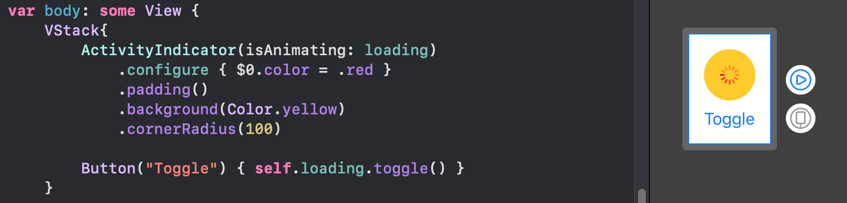
이 기반을 구현하기 만하면 struct됩니다.
struct ActivityIndicator: UIViewRepresentable {

    typealias UIView = UIActivityIndicatorView
    var isAnimating: Bool
    fileprivate var configuration = { (indicator: UIView) in }

    func makeUIView(context: UIViewRepresentableContext<Self>) -> UIView { UIView() }
    func updateUIView(_ uiView: UIView, context: UIViewRepresentableContext<Self>) {
        isAnimating ? uiView.startAnimating() : uiView.stopAnimating()
        configuration(uiView)
    }
}
? 뼈 확장 :
이 작은 유용한 확장 프로그램을 사용하면 modifier다른 SwiftUI를 통해 구성에 액세스 할 수 있습니다 view.
extension View where Self == ActivityIndicator {
    func configure(_ configuration: @escaping (Self.UIView)->Void) -> Self {
        Self.init(isAnimating: self.isAnimating, configuration: configuration)
    }
}
고전적인 방법 :
또한 클래식 이니셜 라이저에서보기를 구성 할 수 있습니다.
ActivityIndicator(isAnimating: loading) {
    $0.color = .red
    $0.hidesWhenStopped = false
    //Any other UIActivityIndicatorView property you like
}
이 방법은 완전히 적용 가능합니다. 예를 들어 여기 에서 동일한 방법으로 TextField를 첫 번째 응답자로 만드는 방법을 볼 수 있습니다.
답변
사용자 지정 지표
Apple은 이제 SwiftUI 2.0에서 기본 활동 표시기를 지원하지만 자신 만의 애니메이션을 구현할 수 있습니다. 이들은 모두 SwiftUI 1.0에서 지원됩니다. 또한 그것은 이다 위젯에서 작업.
호
struct Arcs: View {
    @Binding var isAnimating: Bool
    let count: UInt
    let width: CGFloat
    let spacing: CGFloat

    var body: some View {
        GeometryReader { geometry in
            ForEach(0..<Int(count)) { index in
                item(forIndex: index, in: geometry.size)
                    .rotationEffect(isAnimating ? .degrees(360) : .degrees(0))
                    .animation(
                        Animation.default
                            .speed(Double.random(in: 0.2...0.5))
                            .repeatCount(isAnimating ? .max : 1, autoreverses: false)
                    )
            }
        }
        .aspectRatio(contentMode: .fit)
    }

    private func item(forIndex index: Int, in geometrySize: CGSize) -> some View {
        Group { () -> Path in
            var p = Path()
            p.addArc(center: CGPoint(x: geometrySize.width/2, y: geometrySize.height/2),
                     radius: geometrySize.width/2 - width/2 - CGFloat(index) * (width + spacing),
                     startAngle: .degrees(0),
                     endAngle: .degrees(Double(Int.random(in: 120...300))),
                     clockwise: true)
            return p.strokedPath(.init(lineWidth: width))
        }
        .frame(width: geometrySize.width, height: geometrySize.height)
    }
}
다양한 변형 데모

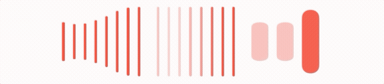
바
struct Bars: View {
    @Binding var isAnimating: Bool
    let count: UInt
    let spacing: CGFloat
    let cornerRadius: CGFloat
    let scaleRange: ClosedRange<Double>
    let opacityRange: ClosedRange<Double>

    var body: some View {
        GeometryReader { geometry in
            ForEach(0..<Int(count)) { index in
                item(forIndex: index, in: geometry.size)
            }
        }
        .aspectRatio(contentMode: .fit)
    }

    private var scale: CGFloat { CGFloat(isAnimating ? scaleRange.lowerBound : scaleRange.upperBound) }
    private var opacity: Double { isAnimating ? opacityRange.lowerBound : opacityRange.upperBound }

    private func size(count: UInt, geometry: CGSize) -> CGFloat {
        (geometry.width/CGFloat(count)) - (spacing-2)
    }

    private func item(forIndex index: Int, in geometrySize: CGSize) -> some View {
        RoundedRectangle(cornerRadius: cornerRadius,  style: .continuous)
            .frame(width: size(count: count, geometry: geometrySize), height: geometrySize.height)
            .scaleEffect(x: 1, y: scale, anchor: .center)
            .opacity(opacity)
            .animation(
                Animation
                    .default
                    .repeatCount(isAnimating ? .max : 1, autoreverses: true)
                    .delay(Double(index) / Double(count) / 2)
            )
            .offset(x: CGFloat(index) * (size(count: count, geometry: geometrySize) + spacing))
    }
}
다양한 변형 데모
눈가리개 가죽
struct Blinking: View {
    @Binding var isAnimating: Bool
    let count: UInt
    let size: CGFloat

    var body: some View {
        GeometryReader { geometry in
            ForEach(0..<Int(count)) { index in
                item(forIndex: index, in: geometry.size)
                    .frame(width: geometry.size.width, height: geometry.size.height)

            }
        }
        .aspectRatio(contentMode: .fit)
    }

    private func item(forIndex index: Int, in geometrySize: CGSize) -> some View {
        let angle = 2 * CGFloat.pi / CGFloat(count) * CGFloat(index)
        let x = (geometrySize.width/2 - size/2) * cos(angle)
        let y = (geometrySize.height/2 - size/2) * sin(angle)
        return Circle()
            .frame(width: size, height: size)
            .scaleEffect(isAnimating ? 0.5 : 1)
            .opacity(isAnimating ? 0.25 : 1)
            .animation(
                Animation
                    .default
                    .repeatCount(isAnimating ? .max : 1, autoreverses: true)
                    .delay(Double(index) / Double(count) / 2)
            )
            .offset(x: x, y: y)
    }
}
다양한 변형 데모
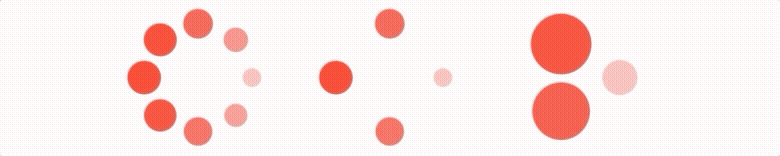
코드 벽 을 방지하기 위해 git에 호스팅 된 이 저장소 에서보다 우아한 표시기를 찾을 수 있습니다 .
이러한 모든 애니메이션에는 실행하려면 반드시 토글 해야Binding 하는가 있습니다.
답변
SwiftUI를 사용하여 클래식 UIKit 표시기를 구현했습니다.
여기에서 작동중인 활동 표시기를 확인하세요.
struct ActivityIndicator: View {
  @State private var currentIndex: Int = 0

  func incrementIndex() {
    currentIndex += 1
    DispatchQueue.main.asyncAfter(deadline: .now() + .milliseconds(50), execute: {
      self.incrementIndex()
    })
  }

  var body: some View {
    GeometryReader { (geometry: GeometryProxy) in
      ForEach(0..<12) { index in
        Group {
          Rectangle()
            .cornerRadius(geometry.size.width / 5)
            .frame(width: geometry.size.width / 8, height: geometry.size.height / 3)
            .offset(y: geometry.size.width / 2.25)
            .rotationEffect(.degrees(Double(-360 * index / 12)))
            .opacity(self.setOpacity(for: index))
        }.frame(width: geometry.size.width, height: geometry.size.height)
      }
    }
    .aspectRatio(1, contentMode: .fit)
    .onAppear {
      self.incrementIndex()
    }
  }

  func setOpacity(for index: Int) -> Double {
    let opacityOffset = Double((index + currentIndex - 1) % 11 ) / 12 * 0.9
    return 0.1 + opacityOffset
  }
}

struct ActivityIndicator_Previews: PreviewProvider {
  static var previews: some View {
    ActivityIndicator()
      .frame(width: 50, height: 50)
      .foregroundColor(.blue)
  }
}
답변
Mojatba Hosseini 의 답변 외에도 ,
빠른 패키지에 넣을 수 있도록 몇 가지 업데이트를했습니다 .
활동 표시기 :
import Foundation
import SwiftUI
import UIKit

public struct ActivityIndicator: UIViewRepresentable {

  public typealias UIView = UIActivityIndicatorView
  public var isAnimating: Bool = true
  public var configuration = { (indicator: UIView) in }

 public init(isAnimating: Bool, configuration: ((UIView) -> Void)? = nil) {
    self.isAnimating = isAnimating
    if let configuration = configuration {
        self.configuration = configuration
    }
 }

 public func makeUIView(context: UIViewRepresentableContext<Self>) -> UIView {
    UIView()
 }

 public func updateUIView(_ uiView: UIView, context:
    UIViewRepresentableContext<Self>) {
     isAnimating ? uiView.startAnimating() : uiView.stopAnimating()
     configuration(uiView)
}}
신장:
public extension View where Self == ActivityIndicator {
func configure(_ configuration: @escaping (Self.UIView) -> Void) -> Self {
    Self.init(isAnimating: self.isAnimating, configuration: configuration)
 }
}
답변
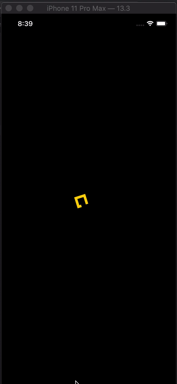
SwiftUI의 활동 표시기
import SwiftUI

struct Indicator: View {

    @State var animateTrimPath = false
    @State var rotaeInfinity = false

    var body: some View {

        ZStack {
            Color.black
                .edgesIgnoringSafeArea(.all)
            ZStack {
                Path { path in
                    path.addLines([
                        .init(x: 2, y: 1),
                        .init(x: 1, y: 0),
                        .init(x: 0, y: 1),
                        .init(x: 1, y: 2),
                        .init(x: 3, y: 0),
                        .init(x: 4, y: 1),
                        .init(x: 3, y: 2),
                        .init(x: 2, y: 1)
                    ])
                }
                .trim(from: animateTrimPath ? 1/0.99 : 0, to: animateTrimPath ? 1/0.99 : 1)
                .scale(50, anchor: .topLeading)
                .stroke(Color.yellow, lineWidth: 20)
                .offset(x: 110, y: 350)
                .animation(Animation.easeInOut(duration: 1.5).repeatForever(autoreverses: true))
                .onAppear() {
                    self.animateTrimPath.toggle()
                }
            }
            .rotationEffect(.degrees(rotaeInfinity ? 0 : -360))
            .scaleEffect(0.3, anchor: .center)
            .animation(Animation.easeInOut(duration: 1.5)
            .repeatForever(autoreverses: false))
            .onAppear(){
                self.rotaeInfinity.toggle()
            }
        }
    }
}

struct Indicator_Previews: PreviewProvider {
    static var previews: some View {
        Indicator()
    }
}