왼쪽은 녹색이고 오른쪽은 회색입니다. 위의 그림과 같이 완벽합니다. 가급적 순수한 CSS 솔루션 (WebKit에 대해서만 걱정할 필요가 있음).
그런 일이 가능합니까?
답변
순수한 CSS 솔루션 :
- Chrome : 에서 오버플로를 숨기고
input[range]왼쪽의 모든 공간을 그림자 색상으로 채 웁니다. - IE : 바퀴를 재발 명 할 필요가 없습니다.
::-ms-fill-lower - Firefox 는 바퀴를 재발 명 할 필요가 없습니다 :
::-moz-range-progress
/*Chrome*/
@media screen and (-webkit-min-device-pixel-ratio:0) {
    input[type='range'] {
      overflow: hidden;
      width: 80px;
      -webkit-appearance: none;
      background-color: #9a905d;
    }

    input[type='range']::-webkit-slider-runnable-track {
      height: 10px;
      -webkit-appearance: none;
      color: #13bba4;
      margin-top: -1px;
    }

    input[type='range']::-webkit-slider-thumb {
      width: 10px;
      -webkit-appearance: none;
      height: 10px;
      cursor: ew-resize;
      background: #434343;
      box-shadow: -80px 0 0 80px #43e5f7;
    }

}
/** FF*/
input[type="range"]::-moz-range-progress {
  background-color: #43e5f7;
}
input[type="range"]::-moz-range-track {
  background-color: #9a905d;
}
/* IE*/
input[type="range"]::-ms-fill-lower {
  background-color: #43e5f7;
}
input[type="range"]::-ms-fill-upper {
  background-color: #9a905d;
}<input type="range"/>답변
받아 들여지는 대답은 이론적으로는 좋지만 엄지 손가락이 .NET에 의해 잘리지 않고 트랙의 크기보다 클 수 없다는 사실을 무시합니다 overflow: hidden. 약간의 JS로 이것을 처리하는 방법에 대한이 예제를 참조하십시오.
// .chrome styling Vanilla JS

document.getElementById("myinput").oninput = function() {
  this.style.background = 'linear-gradient(to right, #82CFD0 0%, #82CFD0 ' + this.value + '%, #fff ' + this.value + '%, white 100%)'
};
#myinput {
background: linear-gradient(to right, #82CFD0 0%, #82CFD0 50%, #fff 50%, #fff 100%);
border: solid 1px #82CFD0;
border-radius: 8px;
height: 7px;
width: 356px;
outline: none;
transition: background 450ms ease-in;
-webkit-appearance: none;
}<div class="chrome">
<input id="myinput" type="range" value="50" />
</div>답변
예, 가능합니다. input rangeHTML5 및 HTML5에 추가 된 새로운 요소는 초안 일 뿐이므로 (그리고 오래 지속될 것이므로) 모든 브라우저에서 제대로 지원되지 않기 때문에 권장하지는 않지만 스타일링에 관해서는 아마도 최고가 아닐 것입니다. 선택.
또한 약간의 JavaScript도 필요합니다. 단순성을 위해 jQuery 라이브러리를 자유롭게 사용할 수 있었습니다.
여기 있습니다 : http://jsfiddle.net/JnrvG/1/ .
답변
이것에 대한 작은 업데이트 :
다음을 사용하면 마우스 릴리스가 아닌 즉석에서 업데이트됩니다.
“mousemove 변경”, 기능 “
<script>
$('input[type="range"]').on("change mousemove", function () {
    var val = ($(this).val() - $(this).attr('min')) / ($(this).attr('max') - $(this).attr('min'));

    $(this).css('background-image',
                '-webkit-gradient(linear, left top, right top, '
                + 'color-stop(' + val + ', #2f466b), '
                + 'color-stop(' + val + ', #d3d3db)'
                + ')'
                );
});</script>
답변
위에 구축 @ dargue3의 당신이 트랙보다 크게 엄지 손가락을 원한다면, 당신은 완전히 이용하려면, 대답<input type="range" /> 크로스 브라우저를 요소와 이동, 당신은 JS 및 CSS의 약간의 추가 라인이 필요합니다.
크롬 / 모질라에서 당신이 사용할 수있는 linear-gradient기술을,하지만 당신은에 따라 비율을 조정해야 min, max, value언급 한 바와 같이 속성을 여기 에서 @Attila O. . Edge에 적용하지 않는지 확인해야합니다. 그렇지 않으면 엄지 손가락이 표시되지 않습니다. @Geoffrey Lalloué가 여기 에 더 자세히 설명 합니다. .
언급 할 가치가있는 또 다른 점은 rangeEl.style.height = "20px";IE / 이전 버전에서 를 조정해야한다는 것 입니다. 간단히 말해서이 경우 “높이가 트랙에 적용되지 않고 엄지 손가락을 포함한 전체 입력”이기 때문입니다. 깡깡이
/**
 * Sniffs for Older Edge or IE,
 * more info here:
 * https://stackoverflow.com/q/31721250/3528132
 */
function isOlderEdgeOrIE() {
  return (
    window.navigator.userAgent.indexOf("MSIE ") > -1 ||
    !!navigator.userAgent.match(/Trident.*rv\:11\./) ||
    window.navigator.userAgent.indexOf("Edge") > -1
  );
}

function valueTotalRatio(value, min, max) {
  return ((value - min) / (max - min)).toFixed(2);
}

function getLinearGradientCSS(ratio, leftColor, rightColor) {
  return [
    '-webkit-gradient(',
    'linear, ',
    'left top, ',
    'right top, ',
    'color-stop(' + ratio + ', ' + leftColor + '), ',
    'color-stop(' + ratio + ', ' + rightColor + ')',
    ')'
  ].join('');
}

function updateRangeEl(rangeEl) {
  var ratio = valueTotalRatio(rangeEl.value, rangeEl.min, rangeEl.max);

  rangeEl.style.backgroundImage = getLinearGradientCSS(ratio, '#919e4b', '#c5c5c5');
}

function initRangeEl() {
  var rangeEl = document.querySelector('input[type=range]');
  var textEl = document.querySelector('input[type=text]');

  /**
   * IE/Older Edge FIX
   * On IE/Older Edge the height of the <input type="range" />
   * is the whole element as oposed to Chrome/Moz
   * where the height is applied to the track.
   *
   */
  if (isOlderEdgeOrIE()) {
    rangeEl.style.height = "20px";
    // IE 11/10 fires change instead of input
    // https://stackoverflow.com/a/50887531/3528132
    rangeEl.addEventListener("change", function(e) {
      textEl.value = e.target.value;
    });
    rangeEl.addEventListener("input", function(e) {
      textEl.value = e.target.value;
    });
  } else {
    updateRangeEl(rangeEl);
    rangeEl.addEventListener("input", function(e) {
      updateRangeEl(e.target);
      textEl.value = e.target.value;
    });
  }
}

initRangeEl();input[type="range"] {
-webkit-appearance: none;
-moz-appearance: none;
width: 300px;
height: 5px;
padding: 0;
border-radius: 2px;
outline: none;
cursor: pointer;
}
/*Chrome thumb*/
input[type="range"]::-webkit-slider-thumb {
-webkit-appearance: none;
-moz-appearance: none;
-webkit-border-radius: 5px;
/*16x16px adjusted to be same as 14x14px on moz*/
height: 16px;
width: 16px;
border-radius: 5px;
background: #e7e7e7;
border: 1px solid #c5c5c5;
}
/*Mozilla thumb*/
input[type="range"]::-moz-range-thumb {
-webkit-appearance: none;
-moz-appearance: none;
-moz-border-radius: 5px;
height: 14px;
width: 14px;
border-radius: 5px;
background: #e7e7e7;
border: 1px solid #c5c5c5;
}
/*IE & Edge input*/
input[type=range]::-ms-track {
width: 300px;
height: 6px;
/*remove bg colour from the track, we'll use ms-fill-lower and ms-fill-upper instead */
background: transparent;
/*leave room for the larger thumb to overflow with a transparent border */
border-color: transparent;
border-width: 2px 0;
/*remove default tick marks*/
color: transparent;
}
/*IE & Edge thumb*/
input[type=range]::-ms-thumb {
height: 14px;
width: 14px;
border-radius: 5px;
background: #e7e7e7;
border: 1px solid #c5c5c5;
}
/*IE & Edge left side*/
input[type=range]::-ms-fill-lower {
background: #919e4b;
border-radius: 2px;
}
/*IE & Edge right side*/
input[type=range]::-ms-fill-upper {
background: #c5c5c5;
border-radius: 2px;
}
/*IE disable tooltip*/
input[type=range]::-ms-tooltip {
display: none;
}
input[type="text"] {
border: none;
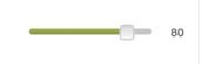
}<input type="range" value="80" min="10" max="100" step="1" />
<input type="text" value="80" size="3" />답변
이전에 승인 된 솔루션이 더 이상 작동하지 않습니다 .
range커서 앞에 필요한 막대를 추가하여 스타일이 지정된 컨테이너 에을 래핑하는 간단한 함수를 코딩했습니다 . CSS에 설정된 ‘파란색’과 ‘주황색’의 두 가지 색상을 쉽게 볼 수 있도록 이 예제를 작성 하여 빠르게 수정할 수 있습니다.
답변
첫 번째 대답을 사용하면 엄지 손가락에 문제가 있습니다. 크롬에서 엄지 손가락 을 트랙보다 크게 하려면 상자 그림자가 엄지 손가락 높이와 트랙을 겹칩니다.
이 모든 답변을 요약하고 더 큰 슬라이더 엄지로 정상적으로 작동하는 슬라이더를 작성했습니다. jsfiddle
const slider = document.getElementById("myinput")
const min = slider.min
const max = slider.max
const value = slider.value

slider.style.background = `linear-gradient(to right, red 0%, red ${(value-min)/(max-min)*100}%, #DEE2E6 ${(value-min)/(max-min)*100}%, #DEE2E6 100%)`

slider.oninput = function() {
  this.style.background = `linear-gradient(to right, red 0%, red ${(this.value-this.min)/(this.max-this.min)*100}%, #DEE2E6 ${(this.value-this.min)/(this.max-this.min)*100}%, #DEE2E6 100%)`
};
#myinput {
border-radius: 8px;
height: 4px;
width: 150px;
outline: none;
-webkit-appearance: none;
}
input[type='range']::-webkit-slider-thumb {
width: 6px;
-webkit-appearance: none;
height: 12px;
background: black;
border-radius: 2px;
}<div class="chrome">
<input id="myinput" type="range" min="0" value="25" max="200" />
</div>